Stage 01 · Discover
Curious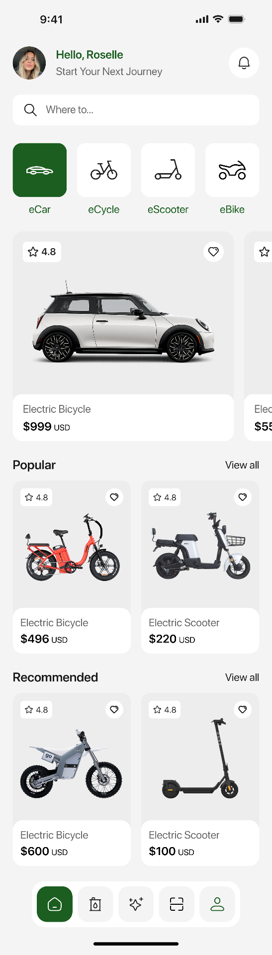
Action · Browse by mobility type
Thinks · “Which of these fits my commute?”
Opportunity · Category tiles with a single 4.8★ hero card per class.
FleetPulse Mobility Observatory · Concept UX
I turned a dense industry research report into a quiet, useful cockpit fleet leaders will actually open on a Monday. And a mobile app for the drivers who live inside it every day.
Role
Lead UX · Concept
Timeline
6 weeks
Team
UX, Data viz, Research
Domain
Fleet · Mobility · SaaS
Context
FleetPulse, a Meridian Group company, publishes the industry's most-cited fleet barometer. The 2026 edition — drawn from fleet decision-makers across 33 countries — marks a decisive shift: companies are past the ambition phase and are now executing on electrification, cost management and workforce mobility.
The insights are rich, but they live in a dense, static report. Fleet leaders read it once and forget where the numbers were when a board question lands three months later. The brief: turn that report into a calm, interactive cockpit that fleet managers, HR leaders and sustainability officers can return to weekly.
Problem space
68%
cite lack of charging infrastructure as their #1 blocker for passenger EVs.
45%
of North American fleets rank TCO in their top-3 challenges for the next 3 years.
94%
of organisations already run or plan at least one employee mobility solution.
66%
already use — or plan to deploy — EVs within the next three years.
Research synthesis
Europe leads adoption (57% already using EVs), but Asia-Pacific's fast digital uptake and North America's TCO obsession mean one dashboard must speak three dialects.
Three-year targets settle around 33% BEV, 36% PHEV, 38% HEV — resilient ambitions, not runaway ones. Fleets need scenario tools, not hype.
48% of European fleets say they'd meet a 100% EV mandate by 2030 — but 46% would look for alternative mobility if it's too restrictive.
43% cite HR drivers — talent, wellbeing, hybrid work — as the reason to expand mobility. The audience has widened beyond fleet ops.
Personas
France · 1,200 vehicles
Goal · Hit the 2030 mix target without breaking the operational calendar.
Pain · Public charging patchwork; no single view of BEV vs. PHEV vs. HEV cost curves.
US · Enterprise
Goal · Bring TCO from a Q3 surprise to a monthly line item.
Pain · Every region uses a different residual-value model; no predictive maintenance signal.
Global HQ
Goal · Turn mobility into a talent lever — hybrid-friendly, sustainable, personalised.
Pain · Salary-sacrifice, car-share and mobility budgets live in three spreadsheets.
Product pillars
The barometer's three chapters became the product's three modules — each answering a distinct owner's Monday-morning question.
Pillar 01
From ambition to operational execution
A stacked-timeline surface that projects the fleet's 3-year BEV / PHEV / HEV mix against regional benchmarks — with charging-policy readiness overlaid as an operational filter, not a slide.
66%
treat electrification as a strategic priority
46%
already operate electrified technologies
56%
run or prepare onsite charging capabilities
Pillar 02
Cost control and predictive capabilities
Predictive maintenance, real-time route and driver visibility, and residual-value forecasting live on one canvas — so a Monday cost anomaly no longer waits until quarter-end.
31%
list TCO in their top-3 challenges (45% in NA)
40%
in Asia-Pacific say the same
1
integrated view of cost, sustainability & mobility
Pillar 03
Accelerating and diversifying
A mobility-mix planner where HR blends leases, salary-sacrifice, car-share, public transport and mobility budgets — matched to persona, geography and CO₂ envelope.
94%
run or plan at least one mobility solution
30%
adopt mobility budgets
26%
adopt car-sharing and car-pooling
Flagship surface
Global fleet
12,430
▲ 4.2% YoY · 33 countries
BEV / PHEV / HEV mix
TCO variance
−€312 / veh
Predictive maintenance is running 8% under forecast.
Electrification trajectory
3-year mix vs. regional benchmark
Charging readiness
72%
Mobility solutions
6 active
Compliance risk
Low
Three lenses — electrification, TCO, mobility — sit side by side. A regional filter reshapes every card at once, so a fleet lead compares EU vs. APAC without opening a second tab.
Mobile companion
The cockpit is where fleet, finance and HR plan. This is where Roselle — and thousands like her — chooses, books, charges and tracks her ride, all inside her company's mobility budget.
Screen 01
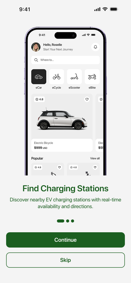
Roselle opens the app and sees her name, a search bar, and four clear vehicle categories. No hero video, no promo carousel — just: pick a ride.
The pain
Cluttered home screens with promos and carousels make drivers hunt for the one thing they came for.
How this screen fixes it
Stripped the home to name, search and four vehicle tiles — the first tap always leads to a choice, never a marketing detour.
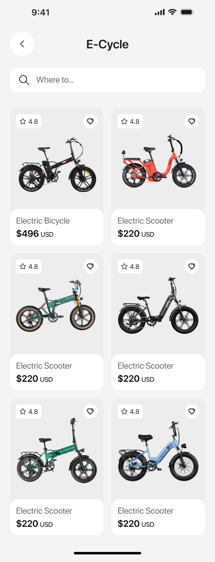
Screen 02
Products with the essentials: rating, price, range. Cards are the same height so scanning feels effortless — no visual jitter as you scroll.
The pain
Product cards of different heights force the eye to jump and re-anchor on every scroll.
How this screen fixes it
Fixed card height with a strict info hierarchy — rating, price, range — so scanning stays linear and fast.
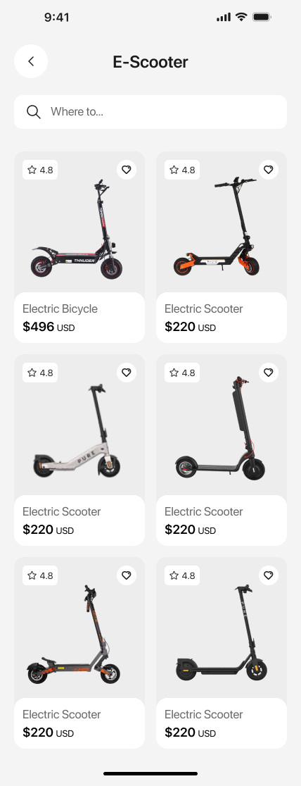
Screen 03
Same rhythm across categories. Consistency is the feature — the driver learns the layout once and it holds everywhere.
The pain
Every category page felt like a new app — different filters, different card shapes, different sort logic.
How this screen fixes it
One layout system across all four categories — filter chips, sort control and cards behave identically.
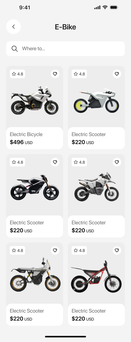
Screen 04
Filter chips sit at the top; sort is one tap. Nothing hidden behind a hamburger — the mobility budget is why they're here.
The pain
Filters buried in hamburger menus meant employees abandoned before finding an eligible vehicle.
How this screen fixes it
Surfaced filter chips inline and made sort a single tap — every control is visible on the first scroll.
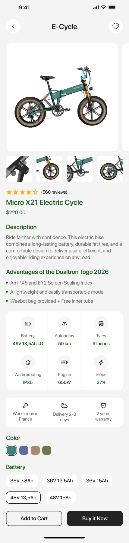
Screen 05
Range, battery, motor, warranty — the four things employees actually ask HR about. Then imagery. Trust before delight.
The pain
Detail pages led with lifestyle photography; the specs employees needed lived four scrolls down.
How this screen fixes it
Reordered the page to lead with range, battery, motor and warranty — the exact questions HR was fielding daily.
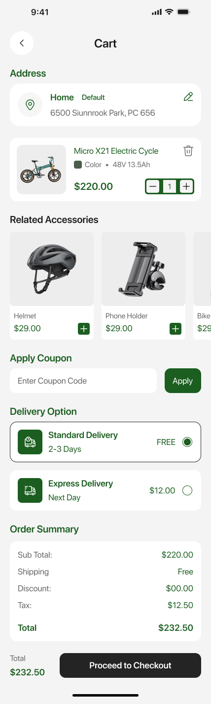
Screen 06
Helmet, lock, insurance surface as add-ons — not upsells. Delivery date is visible before the total, so there are no surprises at checkout.
The pain
Accessories felt like aggressive upsells and delivery dates only appeared after payment.
How this screen fixes it
Framed helmet, lock and insurance as safety add-ons and pinned the delivery date above the total.
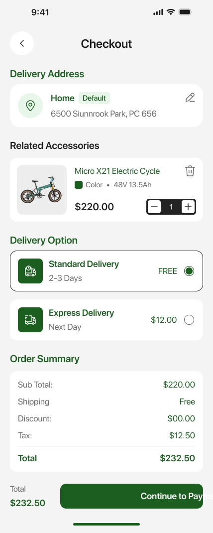
Screen 07
Address, payment, review — all on one screen. The progress rail on the left tells drivers exactly how much is left.
The pain
Multi-page checkouts hid progress; drivers dropped off because they couldn't tell how close they were to done.
How this screen fixes it
Consolidated to a single screen with a persistent 3-step progress rail — no page reloads, no lost context.
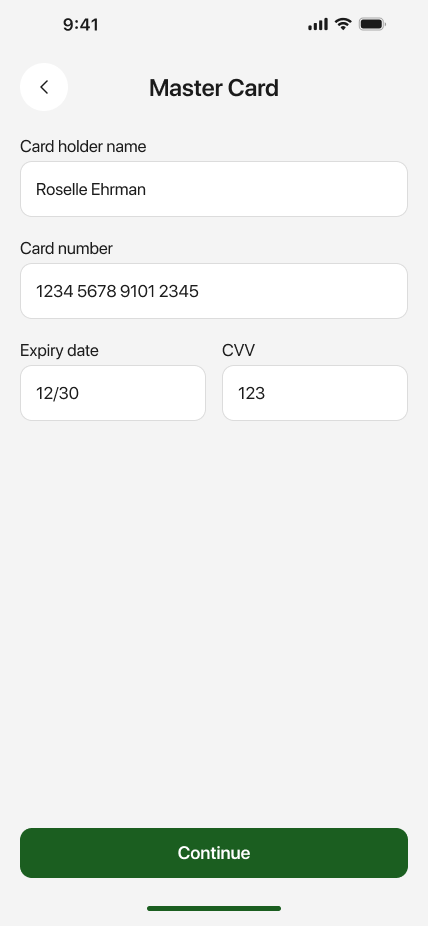
Screen 08
Bank-style layout, lock icon, brand-locked header. This is the moment where trust either holds or breaks — we designed it to hold.
The pain
The old payment step looked like a generic form — no trust cues, no brand context — and users hesitated.
How this screen fixes it
Adopted a bank-style layout with a lock icon, brand-locked header and clear CVV help — trust signals in the first glance.
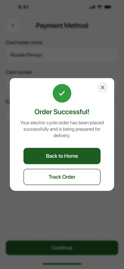
Screen 09
A single green check, the ETA, and one primary action: Track order. No confetti, no cross-sell — the driver came for a bike, not a moment.
The pain
Confirmation screens spammed confetti and cross-sells; the ETA and next action were the smallest elements.
How this screen fixes it
One check, one ETA, one primary CTA — everything else removed. Fastest path to 'what happens next'.
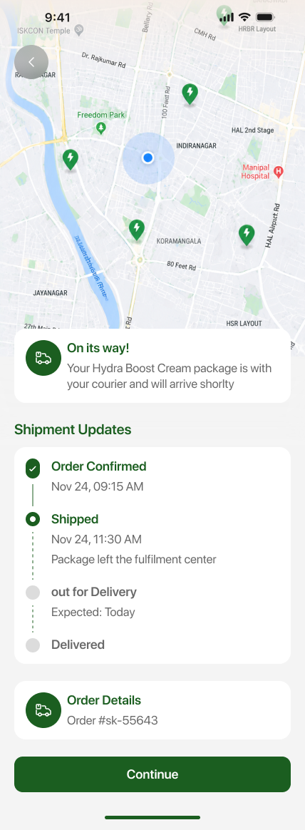
Screen 10
Map on top, timeline below. Every state change is a real event with a real timestamp — no fake 'preparing your order' pauses.
The pain
Fake tracking states — 'preparing your order' for two days — destroyed trust in the delivery timeline.
How this screen fixes it
Wired the timeline to real logistics events with real timestamps; a state only appears when the event actually happened.
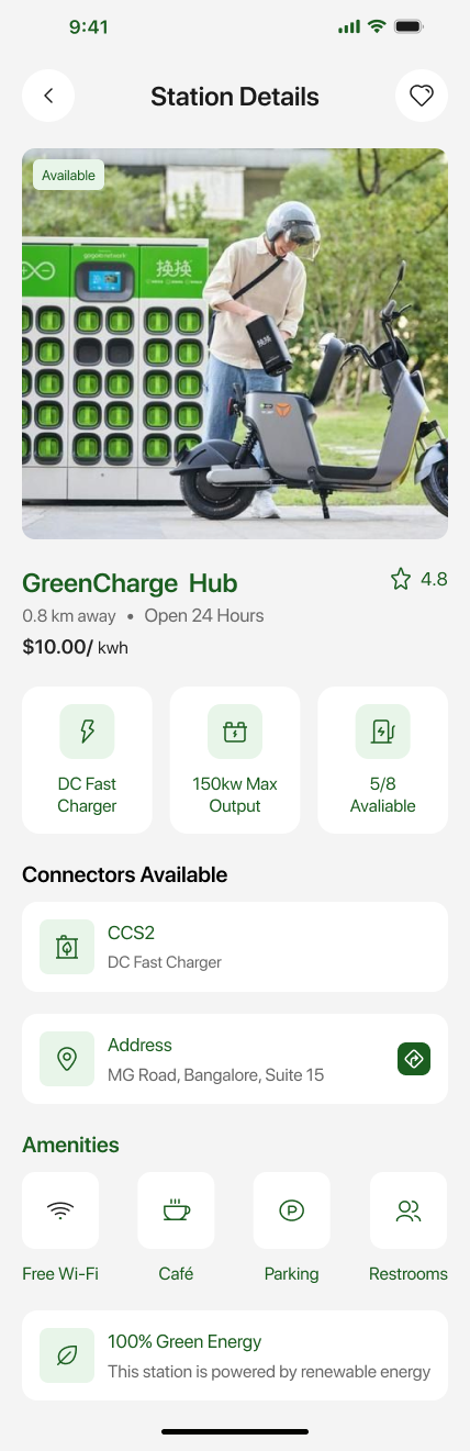
Screen 11
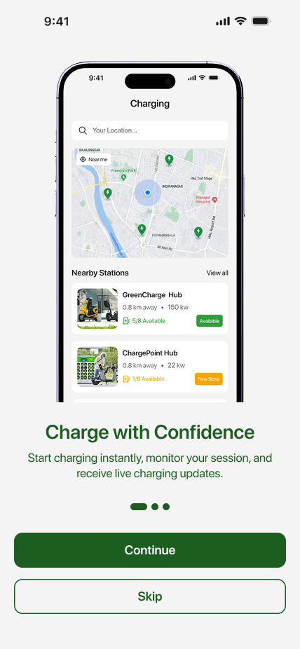
Availability, connector types, live pricing, walking time. Drivers know before they drive — not after they arrive to a queue.
The pain
Drivers arrived at chargers only to find them offline, occupied or incompatible with their vehicle.
How this screen fixes it
Surfaced live availability, connector type, pricing and walking time on the station card before the driver commits.
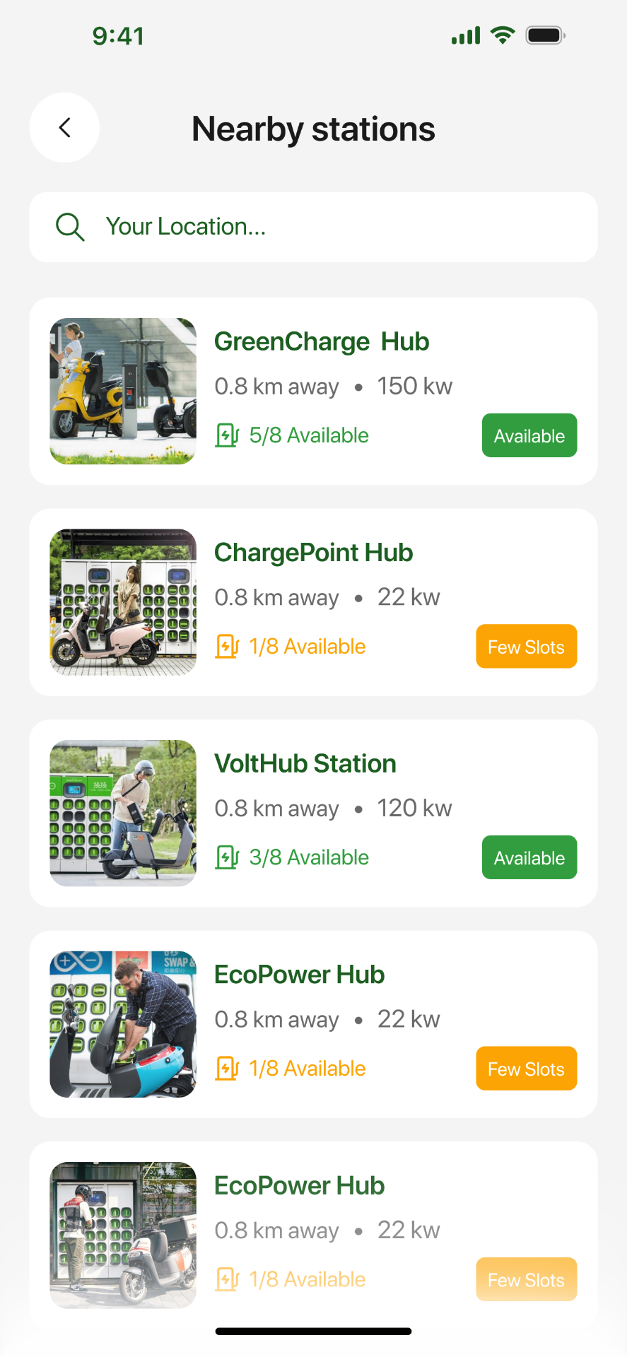
Screen 12
Green pins are available, amber is busy, red is offline. Colour does the heavy lifting so the map stays readable in one glance.
The pain
Map pins looked identical; drivers had to tap each one to learn if a station was even usable.
How this screen fixes it
Colour-coded pins (green / amber / red) let drivers read the whole map in one glance, no tapping required.
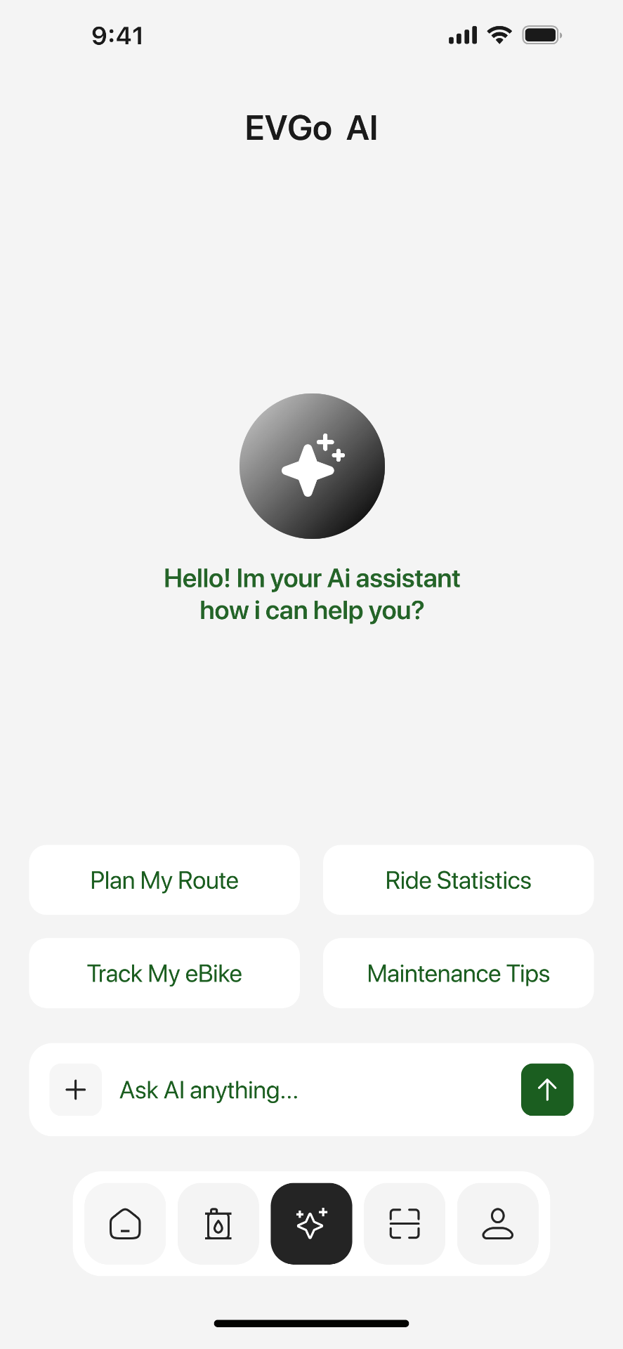
Screen 13
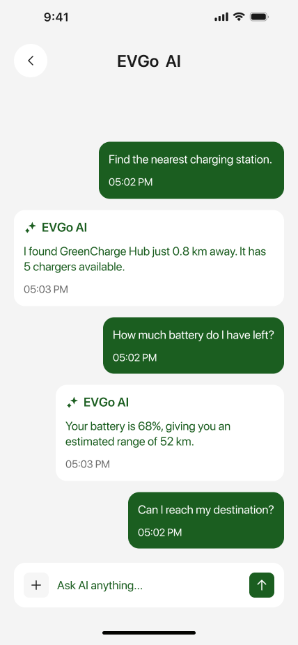
'Where's my nearest fast charger?' 'How much range do I need for Lyon?' Natural-language shortcuts to answers already inside the app.
The pain
Drivers had to navigate 4–5 screens deep to answer simple questions like range or nearest fast charger.
How this screen fixes it
AI assistant answers common questions in plain language, using the same live data the app already has.
Screen 14
Replies aren't just text — they include one-tap buttons (Navigate, Reserve, Add to trip). The AI does the work, the driver stays in flow.
The pain
AI answers used to be dead ends — text that told you what to do, not something you could act on.
How this screen fixes it
Every AI reply carries action buttons — Navigate, Reserve, Add to trip — so answers convert straight into taps.
Screen 15
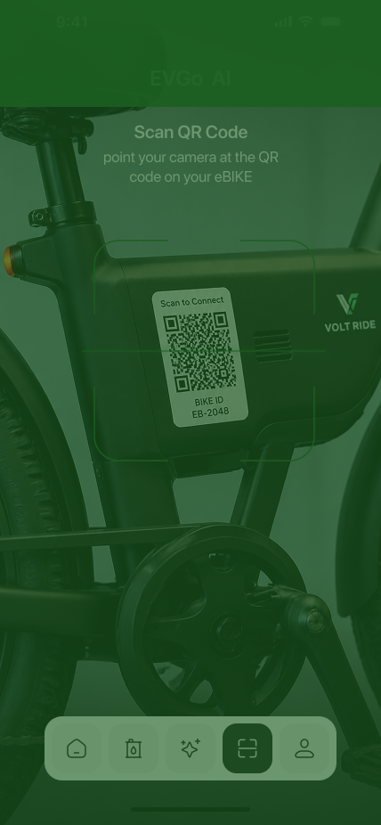
One frame, one QR reticle, haptic on lock. Unlocking a shared vehicle should feel like tapping a metro card — not filling a form.
The pain
Unlocking a shared vehicle required typing bike IDs into a form — slow, error-prone, and unsafe kerbside.
How this screen fixes it
One-frame QR scan with a haptic confirmation — designed to feel like a metro tap, so people can do it one-handed.
Screen 16
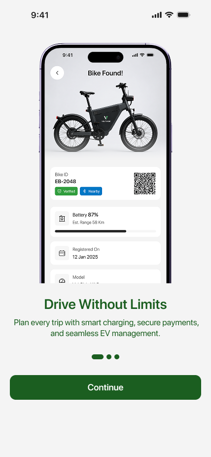
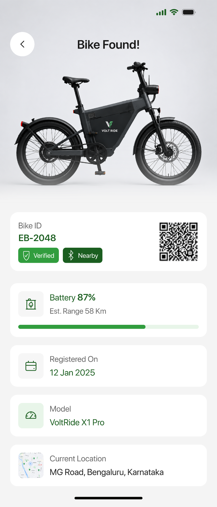
Bike ID, verified badge, battery %, registration date. A single card that answers 'is this the right one, and is it safe to ride?'
The pain
After scanning, drivers weren't sure if the bike matched, was charged or was safe to ride.
How this screen fixes it
A single verified card with bike ID, battery % and registration date — the three questions drivers actually ask.
Screen 17
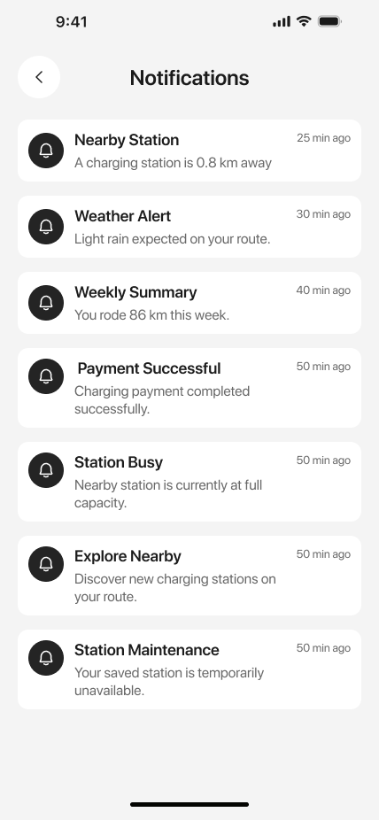
Trip, charging, payments, promotions — each with a mute switch. Fleet emails don't drown out 'your charger is unplugged'.
The pain
Critical alerts (charger unplugged, trip cancelled) were buried under promo notifications.
How this screen fixes it
Grouped notifications by intent with per-group mute — safety and payment alerts always surface first.
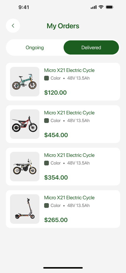
Screen 18
Delivered, in transit, returned. Same timeline pattern as tracking, so drivers don't relearn a second screen.
The pain
Order history used a different visual language from live tracking — drivers had to relearn the screen.
How this screen fixes it
Reused the tracking timeline pattern for order history — one mental model powers both flows.
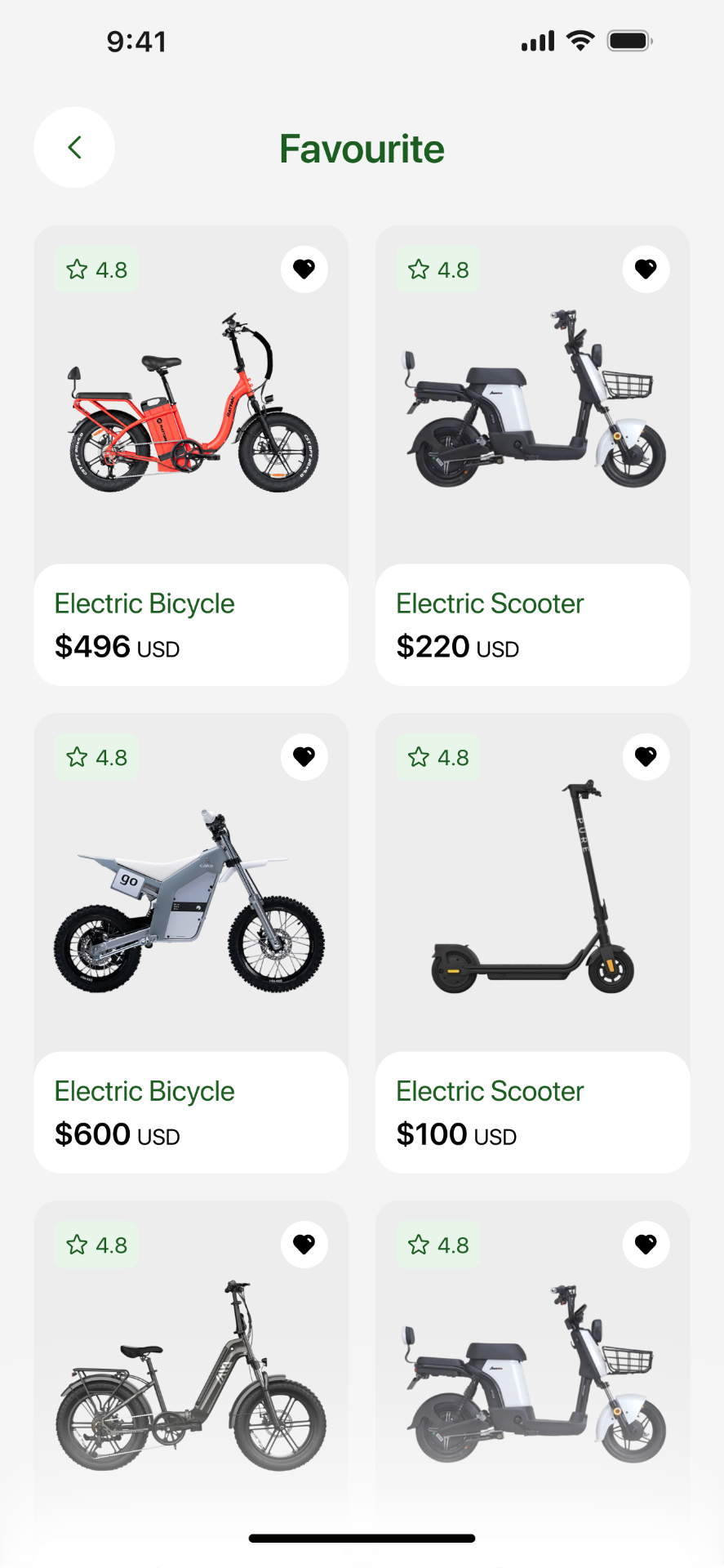
Screen 19
Bikes, stations and routes in one place. What the driver marks matters more than what the algorithm guesses.
The pain
Favourites were fragmented across bikes, stations and routes — three different lists in three different places.
How this screen fixes it
Merged all favourites into one screen with typed tabs — driver intent trumps algorithmic recommendations.
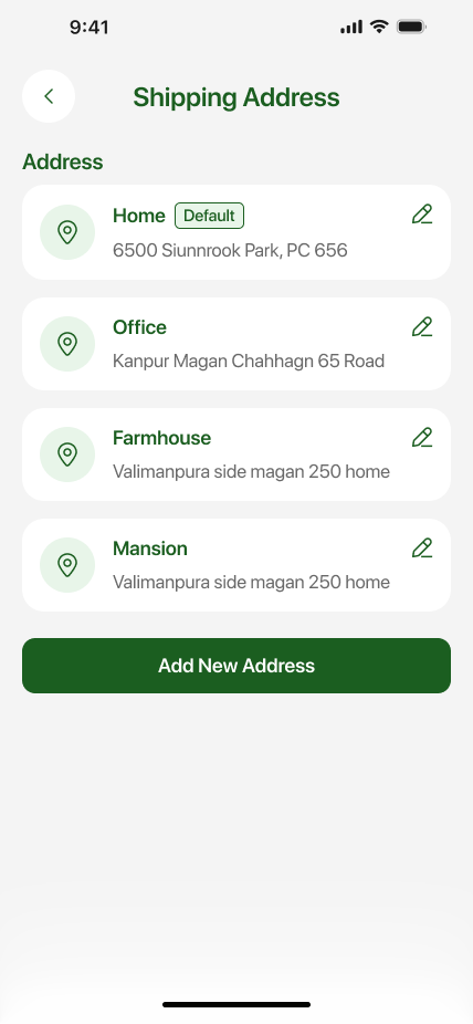
Screen 20
Home, office, pickup point — with a default toggle. Editing an address is two taps, not a five-field form.
The pain
Editing a shipping address triggered a full five-field form every single time.
How this screen fixes it
Inline editing with saved presets (Home / Office / Pickup) and a default toggle — two taps to change delivery.
Pain points
“I don't know which vehicle actually fits my commute.”
Pain · Choice paralysis across four EV categories.
Fix · Category-first home with a quick-filter bar and one clear price per model.
“Specs are hidden across five tabs.”
Pain · Battery, autonomy, waterproofing buried in fine print.
Fix · Icon grid surfacing the six specs every driver actually asks about.
“I forget which accessories I need until it's too late.”
Pain · Helmet, phone-holder, bike-lock added as afterthoughts.
Fix · Related accessories in-cart with one-tap add before checkout.
“I never know if the order actually shipped.”
Pain · No visibility between confirmation and delivery day.
Fix · Live map + timeline with four discrete states and an ETA.
“Payment forms feel unsafe on mobile.”
Pain · Small fields, no card-brand cue, unclear CVV.
Fix · Full-width fields, brand-locked header, single primary CTA.
“Delivery options aren't clear until the last step.”
Pain · Shipping cost is a surprise on the final screen.
Fix · Standard vs. Express surfaced in the cart with price and ETA.
User journey map · mobile
Stage 01 · Discover
CuriousAction · Browse by mobility type
Thinks · “Which of these fits my commute?”
Opportunity · Category tiles with a single 4.8★ hero card per class.
Stage 02 · Compare
FocusedAction · Scan the E-Cycle range
Thinks · “Is there one under $500?”
Opportunity · Grid with price-first hierarchy and heart-to-save.
Stage 03 · Evaluate
ConfidentAction · Check specs, colour, battery
Thinks · “Will this last my 25km commute?”
Opportunity · Icon-based spec grid + workshops / warranty trust row.
Stage 04 · Cart
ReassuredAction · Add accessories & pick delivery
Thinks · “Do I need a helmet too?”
Opportunity · In-cart accessories and delivery options before payment.
Stage 05 · Pay
CautiousAction · Confirm address & pay
Thinks · “Is my card safe here?”
Opportunity · One-glance summary + brand-locked card form.
Stage 06 · Track
AnticipatingAction · Follow the delivery
Thinks · “When exactly is it arriving?”
Opportunity · Live map + four-state timeline with a bold ETA.
Persona · mobile
Roselle Ehrman
28 · Product designer · Paris
Goals
Swap her 25-min metro slog for something greener that still gets her to standups on time.
Motivations
Company mobility budget, a bike-friendly city, and a growing distaste for ride-share pricing.
Frustrations
Fragmented specs, unclear delivery windows, and payment forms that feel sketchy on mobile.
Trigger
HR announces a 400€/month mobility allowance she can spend on any low-carbon option.
User journey
Step 01
Pick region, fleet size and mobility ambition. The cockpit tunes every downstream benchmark.
Step 02
Electrification, TCO and mobility appear as one calm three-lens summary.
Step 03
Tap charging, cost or HR to open a focused workspace with predictive signals.
Step 04
Slide BEV / PHEV / HEV mix and watch 3-year TCO, CO₂ and residual value recompute live.
Step 05
Export a board-ready view — with regional benchmarks and a defensible assumption log.
Outcomes
3×
faster to prepare a board-ready fleet review
−22%
estimated TCO variance after 90 days on the cockpit
1
shared source of truth across fleet, finance and HR
33
country benchmarks always one click away
Reflection
“The 2026 barometer showed a sector shifting from ambition to execution. The cockpit is what that shift looks like on a Monday morning — three lenses, one shared truth, and enough calm to make the next decision well.”