All workCase study · 2026

Cloud platform · Agentic AI operations

Axon — an AI agent workforce nobody could see, turned into one calm control room.

The problem: agents ran from pasted prompts, automations fired unwatched, knowledge went stale in silence and token spend showed up as a single invoice line. No owner, no state, no clock.
The work: one multi-tenant cloud console where every agent, workflow and knowledge source has a single trustworthy state, a named owner, a success rate and a cost per run — scannable as rows, reasoned about on a canvas, and reachable in two keystrokes.

Role
Lead UX — research to delivery
Timeline
12 weeks · two releases
Team
1 PM · 5 Eng · 1 Designer
Platform
Cloud SaaS · multi-tenant web console
Axon dashboard shown on a laptop
01

The problem: a workforce nobody could see

Teams had already adopted AI assistants and automations. What they did not have was a place where those things were owned, measured or safe to change.

Agents lived in nobody's hands

Prompts were pasted into notebooks and chat threads. When an assistant started answering badly, no one knew who owned it, which model it ran, or when it last changed.

Automations were invisible until they broke

Workflows fired on webhooks and schedules with no shared view of runs, success rate or duration — the first signal of failure was an angry customer.

Knowledge drifted silently

PDFs, docs and help-centre pages were indexed once and never revisited, so agents quoted retired pricing with total confidence.

Cost was a monthly surprise

Token spend arrived as one invoice line. Nobody could attribute it to an agent, a workflow or a bad prompt.

Escalation had no shape

When an agent handed a conversation to a human, the trail ended. Escalated threads aged with no owner and no clock.

02

Who I designed for

Four roles share the same console with very different jobs — building, operating, curating and accounting for the workforce.

Automation Operator

“Which of my 40 workflows is failing right now?”

Run health at a glanceFailure alertsCost per run

Agent Builder

“I want to change instructions without breaking production.”

Versioned instructionsTest before publishModel + temperature control

Knowledge Owner

“Is the answer the agent gave still true?”

Index freshnessFailed source visibilityCollection scoping

Ops Lead

“What is this workforce costing, and who is accountable?”

Spend attributionEscalation ownershipAudit trail
03

What research changed

Fourteen sessions with operators, builders and knowledge owners — plus a week reading run logs and support threads.

One state word per object

Every agent, workflow and source resolves to exactly one badge — Active, Paused, Draft, Error, Indexed, Processing, Failed, Syncing. Ambiguous states were the top source of mistrust in research.

Operators live in lists, builders live on canvas

The same feature needs two surfaces: a dense table for scanning hundreds of runs, and a node canvas for reasoning about one flow's branches.

Cost belongs beside behaviour

Showing $/run on the same row as success rate changed decisions instantly — teams paused expensive, low-value workflows within minutes of first use.

The keyboard is the real navigation

Power users asked for one command surface over deeper menus, so ⌘K covers recents, create actions and navigation in a single modal.

04

Information architecture

One sidebar, two groups: Workspace for the work, Settings for the guardrails. Every destination answers a single question.

  1. 01

    Dashboard

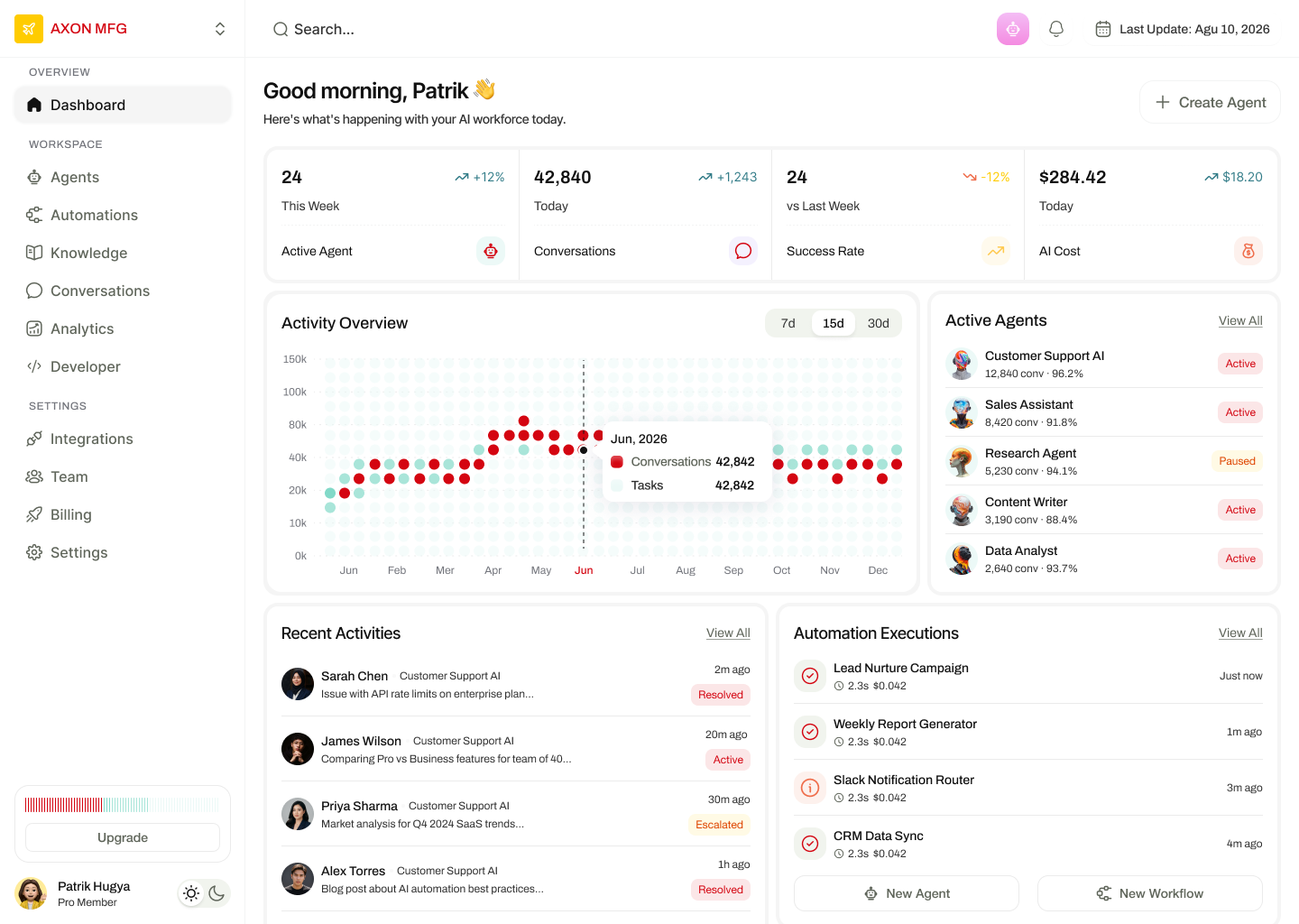
    The morning read: active agents, conversations today, success rate versus last week and AI cost, over one shared 12-month axis.

  2. 02

    Agents

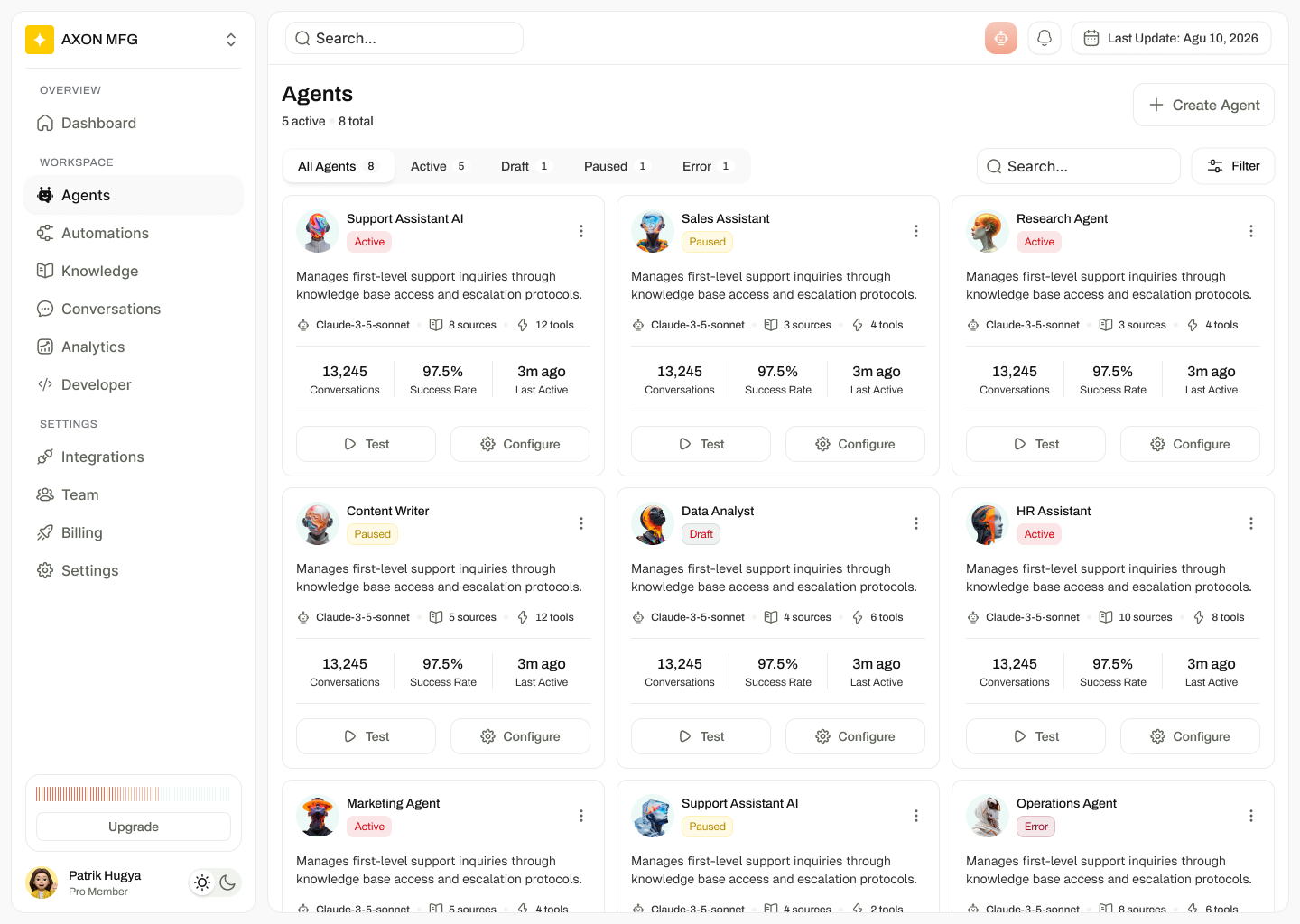
    A catalogue of the workforce — status, model, sources, tools, conversations and success rate, with Test and Configure on every card.

  3. 03

    Automations

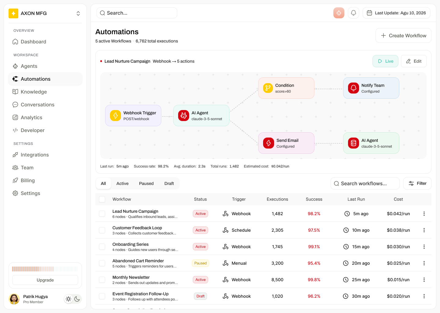
    Workflows as both a live canvas preview and a dense run table filtered by All, Active, Paused and Draft.

  4. 04

    Knowledge

    Sources and collections with index state, chunk counts and last-indexed time, plus drag-and-drop ingestion.

  5. 05

    Conversations & analytics

    Threads, escalations and performance reporting for the whole workforce.

  6. 06

    Command palette

    ⌘K over recents, create actions and navigation, so nothing needs more than two keystrokes.

05

The screens, and the pain each one removes

Every surface below is shown as it ships, with the problem it was built against and the design move that answers it.

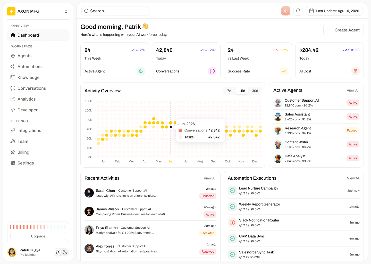
Axon dashboard with four metric tiles, an activity overview chart, active agents list, recent activities and automation executions.

Dashboard — the morning read

The pain

Teams started the day in five tabs and still could not say whether the workforce was healthy.

How this screen fixes it

Four tiles answer volume, quality and cost first; the activity chart, agent list, human activity feed and automation runs sit beneath on one screen — every number carries its own change-versus-last-period.
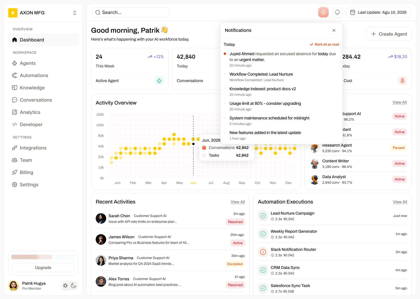
A tighter, higher-contrast version of the Axon dashboard with a red-accented brand mark and denser sidebar.

Dashboard — high-contrast variant

The pain

The first build read as marketing-calm; operators on wall displays lost the signal from across the room.

How this screen fixes it

A second density and contrast pass: tighter sidebar rhythm, stronger accent on the live series and full-width tiles — same information architecture, readable at three metres.

Notifications panel over the dashboard listing absence requests, completed workflows, indexing events and usage warnings.

Notifications — what changed while you were away

The pain

Workflow failures, indexing results and usage limits arrived by email, hours late, to whoever happened to be on the thread.

How this screen fixes it

One panel groups today's events, marks unread with a dot, and mixes system signals (usage at 80%, maintenance) with work signals (workflow completed, knowledge indexed) so nothing needs a separate inbox.

Agents page with tabs for All, Active, Draft, Paused and Error, and cards showing model, sources, tools, conversations and success rate.

Agents — the workforce catalogue

The pain

Nobody could list the agents in production, let alone their model or owner.

How this screen fixes it

Cards carry status, model, source and tool counts, plus three numbers that matter — conversations, success rate, last active — with Test and Configure inline so a fix never needs a detour.

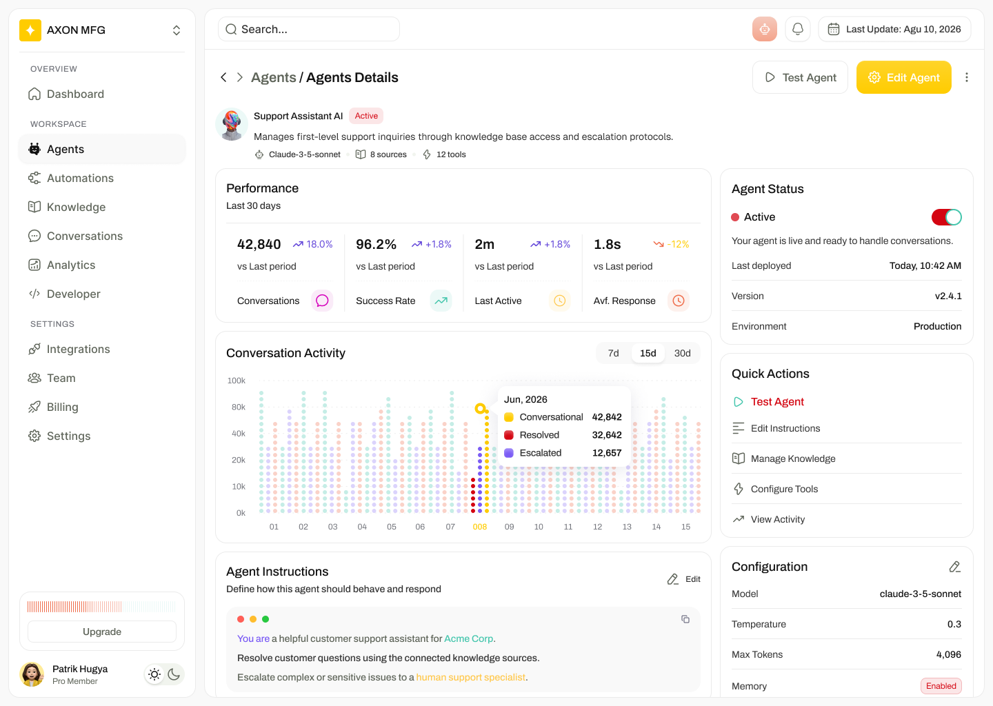
Agent detail page with 30-day performance, conversation activity chart, editable agent instructions and a configuration panel.

Agent detail — behaviour, in the open

The pain

Prompts were edited blind: no version, no environment, no way to tell whether a change helped.

How this screen fixes it

Performance over 30 days sits above the instruction editor, and the right rail pins the live switch, version, environment and model settings — so the person changing behaviour sees the consequences in the same viewport.

Automations page showing a live workflow canvas preview above a table of workflows with status, trigger, executions, success rate and cost.

Automations — canvas plus run table

The pain

A workflow was either a diagram nobody could audit or a log nobody could picture.

How this screen fixes it

The featured flow renders as a canvas with run stats beneath it (last run, success rate, average duration, cost per run); everything else lists as rows that stay put while numbers update.

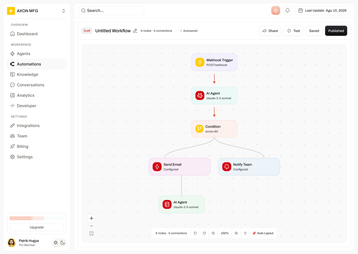
Workflow builder canvas with a webhook trigger, AI agent, condition branch, email and notification nodes, autosave and publish controls.

Workflow builder — branching you can read

The pain

Conditional logic lived in code and in one engineer's head.

How this screen fixes it

Typed, colour-coded nodes and an explicit condition branch make the logic legible; Draft, Autosaved, Test and Published sit in one header row so publishing is a deliberate act, never an accident.

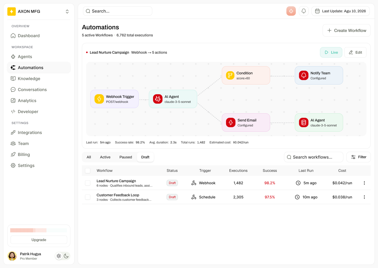
Automations page filtered to Draft, showing only two unpublished workflows.

Draft state — safe to be unfinished

The pain

Half-built automations sat in the same list as production ones and got triggered by mistake.

How this screen fixes it

Draft is a first-class filter: unpublished work keeps its metrics and stays visible, but is clearly separated from anything that can fire.

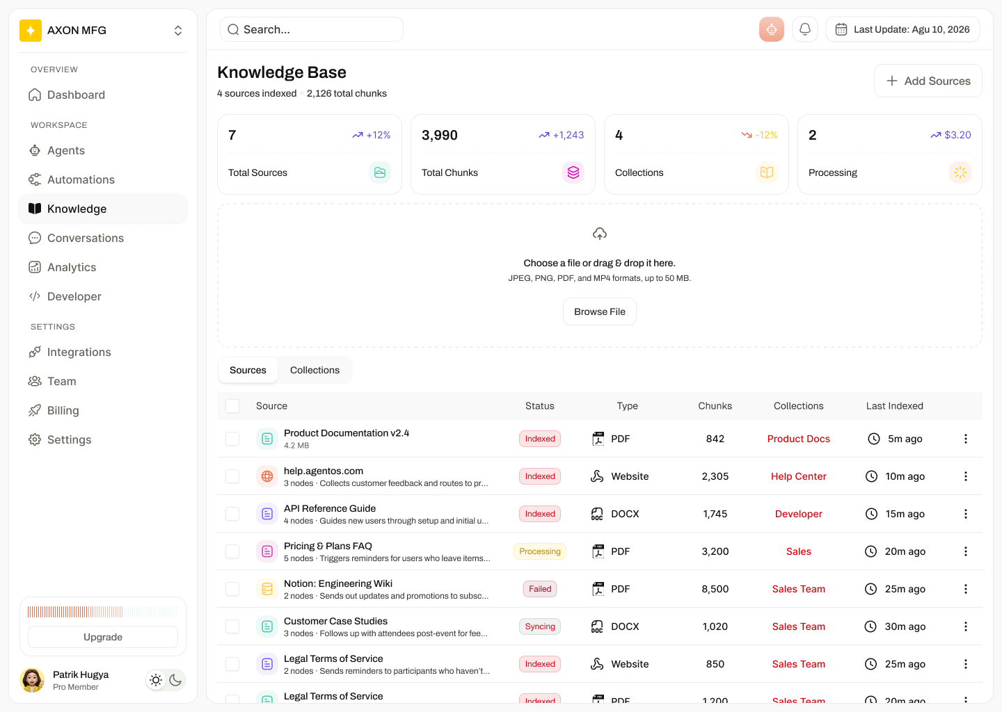
Knowledge base with counts for sources, chunks, collections and processing, a drag-and-drop upload area, and a source table with index states.

Knowledge base — freshness as a status

The pain

Indexing was a black box; stale and failed sources looked identical to healthy ones.

How this screen fixes it

Every source shows Indexed, Processing, Failed or Syncing with chunk count, collection and last-indexed time — so the answer to "is this still true?" is on the row, not in a log.

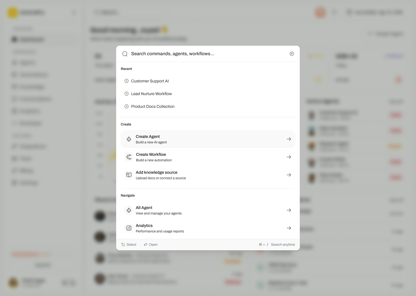
Command palette modal over a blurred dashboard, grouped into Recent, Create and Navigate actions.

Command palette — two keystrokes to anywhere

The pain

Creating an agent or workflow meant three clicks through a growing sidebar.

How this screen fixes it

⌘K groups Recent, Create and Navigate, with arrow-key select and enter-to-open — the fastest path for the operators who live here all day.

06

My role, decisions and constraints

I led UX end to end: research, IA, interaction design, the state and density system, and the spec engineering built from.

One badge vocabulary across the product

Agents, workflows and sources share a single state language and colour mapping. Learn it once on the dashboard and it holds everywhere.

Rows for scanning, canvas for reasoning

Tables never re-order themselves as values change, and the canvas is reserved for structure — the two surfaces never compete.

Cost is a first-class metric

$/run and daily AI cost sit beside success rate rather than in billing, so quality and spend are traded off in the same glance.

Publish is explicit

Autosave protects the draft; Test and Published are separate, deliberate actions. Nothing reaches production by autosave.

Tenant-scoped by default

Every list, chart and export renders after the caller's workspace and role are resolved, so one console safely serves many organisations.

Escalation always names a human

An escalated conversation carries an owner and a clock, so agent-to-human handover has the same accountability as the rest of the queue.

07

Outcomes

Measured across the first two releases with the pilot operations team.

6 → 1
Tools needed to run the agent workforce
−41%
Time to detect a failing workflow
100%
Workflows with a named owner and cost per run
2 keys
To reach any create action
08

Reflections

What I would carry into the next version of this product.

Density earned trust

Every research round asked for more on screen, not less. The second, higher-contrast dashboard was the version operators kept.

Notification volume is the next problem

Grouping by object and severity, plus an explicit acknowledge loop, is the obvious follow-on once the workforce passes fifty agents.

Cost changed behaviour fastest

Putting spend next to success rate produced decisions on day one — a reminder that the smallest number on a row can be the most persuasive.