01
Information overload, zero context
Traditional banking UIs treat every number equally — balances, tickers, alerts and ads compete for the same real estate. Users can't tell what needs attention.
04 · Spatial UX · Banking · Concept
Reimagining retail banking as a spatial experience: a calm café world where your portfolio, goals and research float around you as arrangeable panels — not another dashboard behind another login.
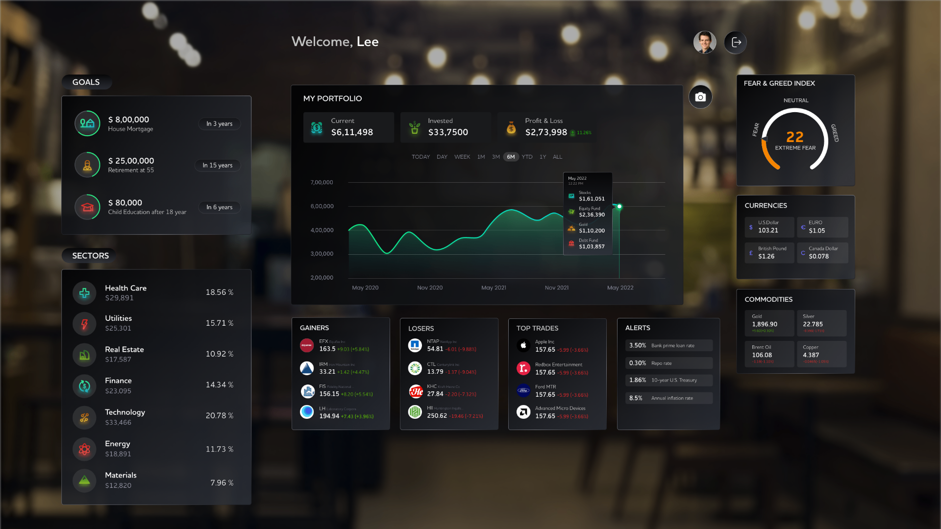
Hotspot 1 · Goals rail
Left-hand rail keeps long-term goals — retirement, home, education — at eye level, so every trade is measured against them.
A concept case study exploring how retail banking and wealth management could feel inside a spatial, immersive metaverse — a calm café instead of a cold trading terminal. The project reimagines portfolio review, goal-based investing, sector research and stock analysis as floating, glanceable panels the customer can arrange around them.
Role
Lead UX — Concept & spatial design
Team
Solo concept · Design exploration
Timeline
6 weeks
Medium
VR / Spatial · Figma · Prototype
Context
Every online bank looks the same — a grid of cards, a sidebar of products, an aggressive push to cross-sell. Meanwhile, the tools people use for everything else — communication, entertainment, work — have become spatial, ambient and personal.
I took inspiration from the UX Collective banking case study and asked a simple question: if the customer stepped into their bank tomorrow, what would we want them to feel? Not overwhelmed. Not sold to. Just informed, in control, and calm.
Problem
01
Traditional banking UIs treat every number equally — balances, tickers, alerts and ads compete for the same real estate. Users can't tell what needs attention.
02
Long-term goals — retirement, a home, a child's education — live in one product. Trades and portfolio changes live in another. Users can't see how today's action moves tomorrow's goal.
03
Reading a market article, checking a stock, comparing peers and looking up fundamentals means jumping across five surfaces. By the time you're done, the insight is gone.
Approach
Rather than porting a 2D dashboard into VR, I designed each screen as a room the customer inhabits — and used the depth, angle and softness of the space to guide attention.
Principle 01
A soft, blurred café backdrop replaces the harsh chrome of a trading terminal. The bank becomes a place, not a product.
Principle 02
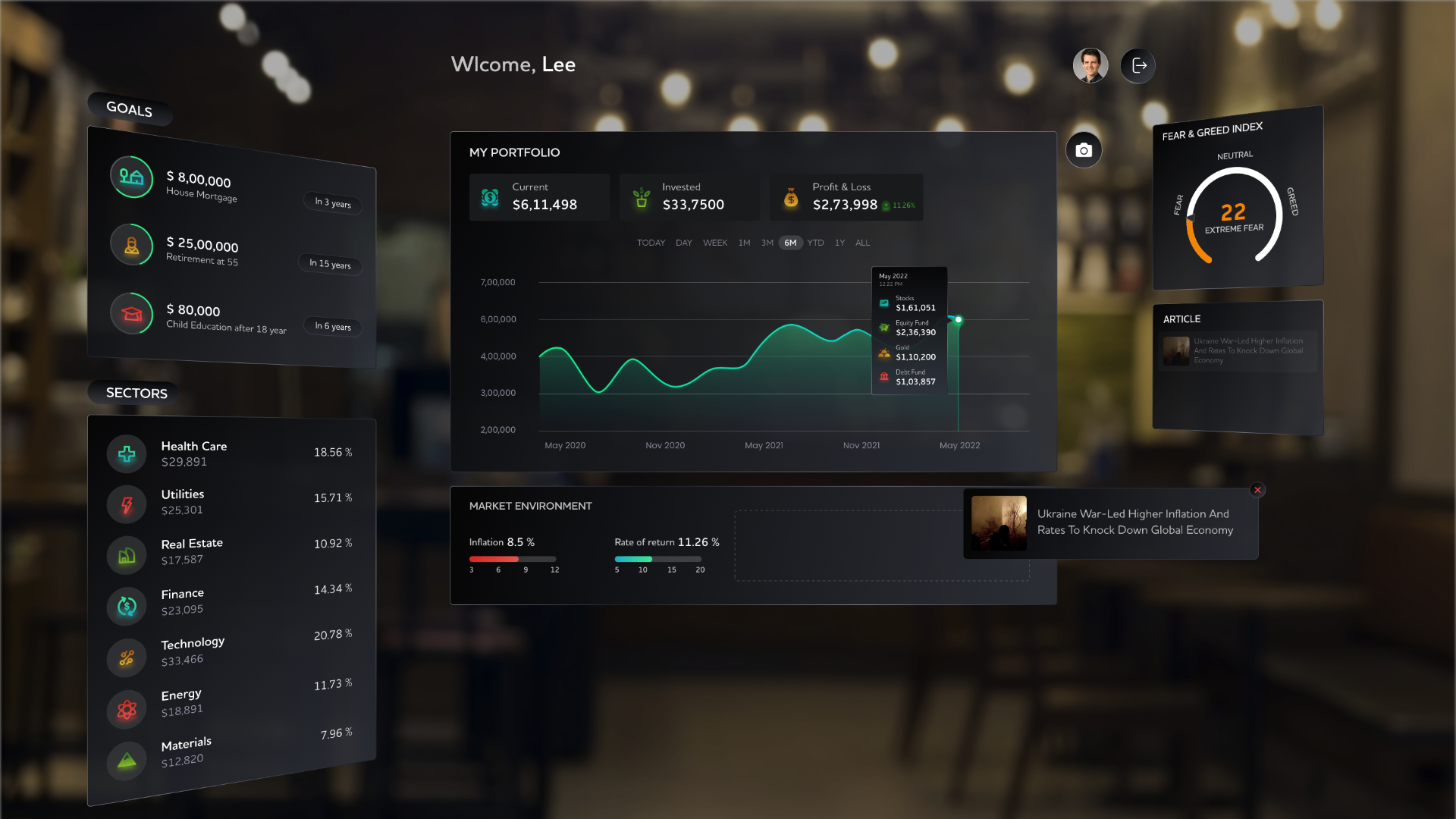
Every module — portfolio, goals, sectors, fear-and-greed, news — is a floating, angled panel the user can glance at or dismiss.
Principle 03
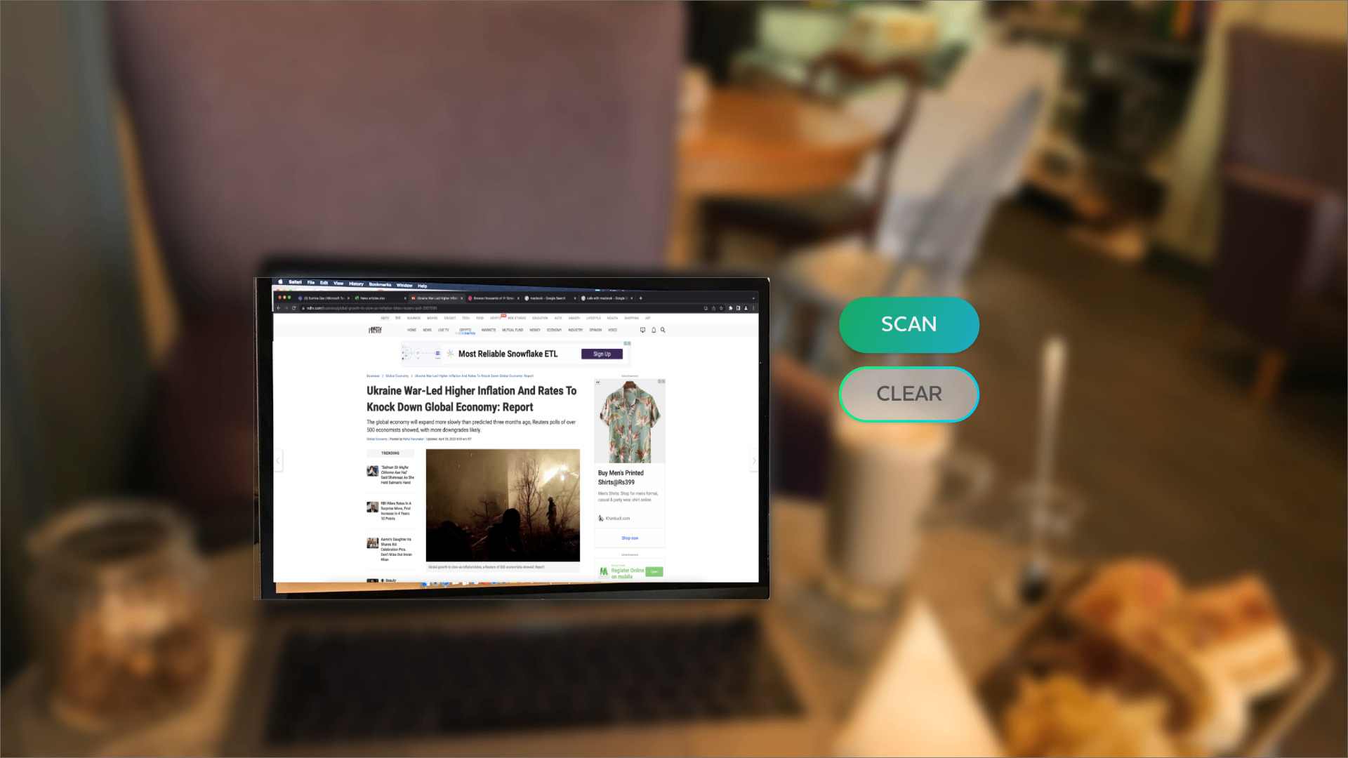
Scan a real-world article. Drag a stock into a basket. Slide a slider to answer a question. Each interaction maps to a single mental action.
Design solution
The home scene arranges the customer's financial life as five soft panels: Goals and Sectors to the left, Portfolio front-and-centre, and Fear & Greed, Currencies and Commodities to the right.
Movers — Gainers, Losers, Top Trades, Alerts — sit below the fold as a quiet ticker rather than a shouting banner.
Deep dive
The most consequential flow in retail investing is the goal check. I designed it as a seven-step spatial journey.
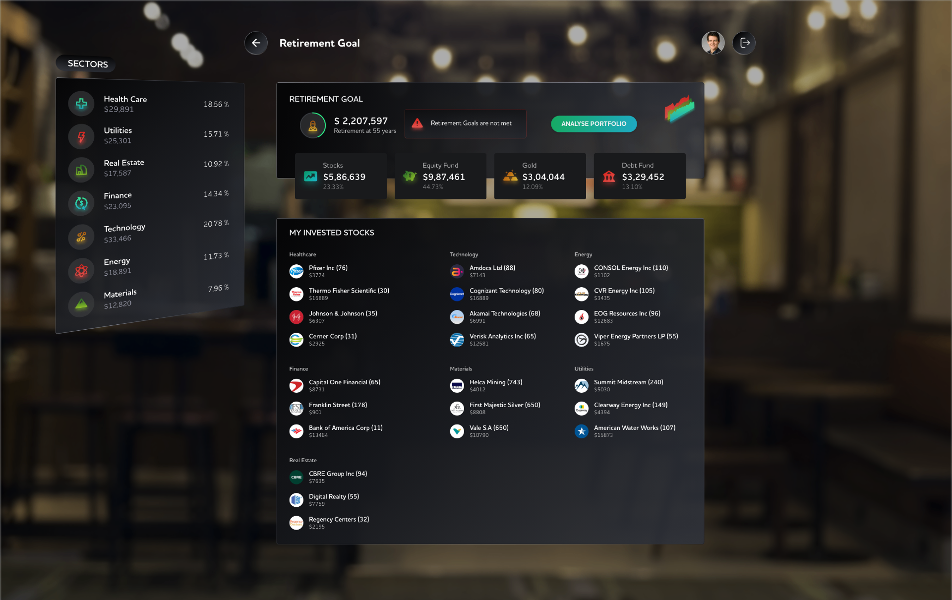
Step 01
Retirement Goal shows corpus, target age, and an honest 'not met' badge — no green vanity metrics.
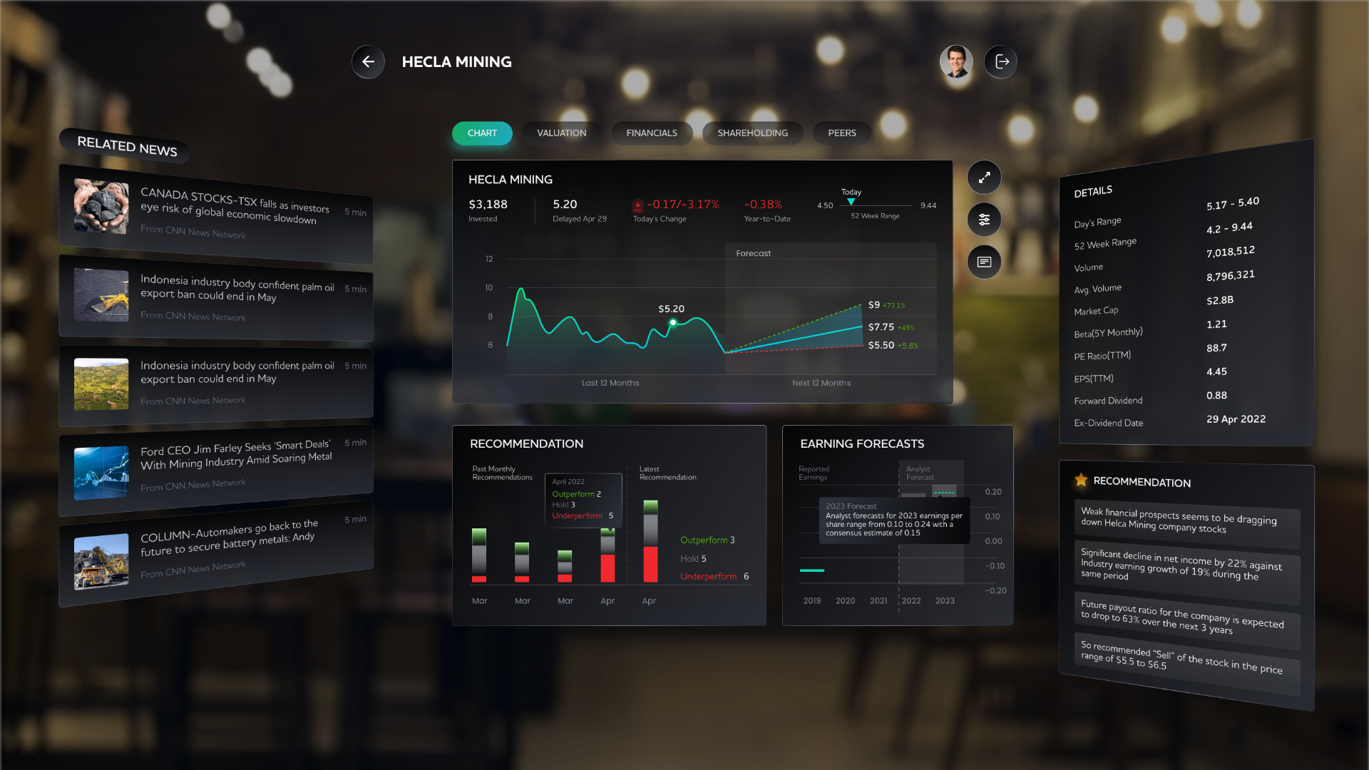
Step 02
Tap a stock and the room reconfigures: chart, news, fundamentals, and a plain-English recommendation.
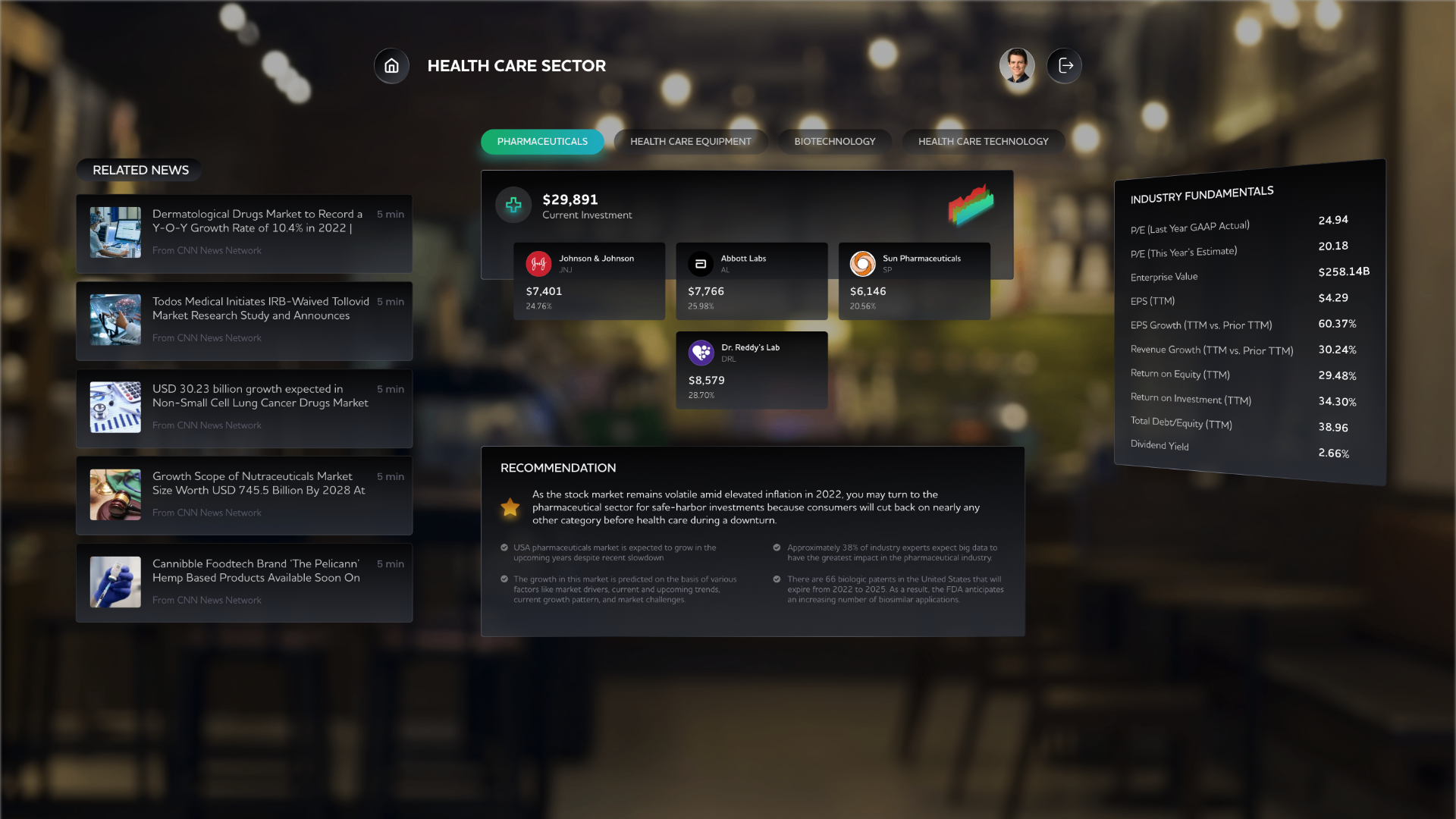
Step 03
Compare the largest holdings in Healthcare / Tech / Financials against related news — without leaving the room.
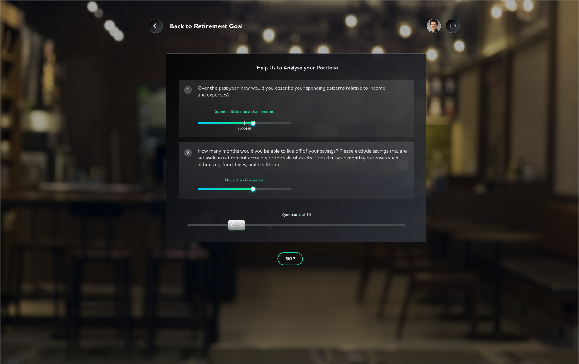
Step 04
Ten short, human questions on a slider — spending, runway, risk appetite. No forms, no jargon.
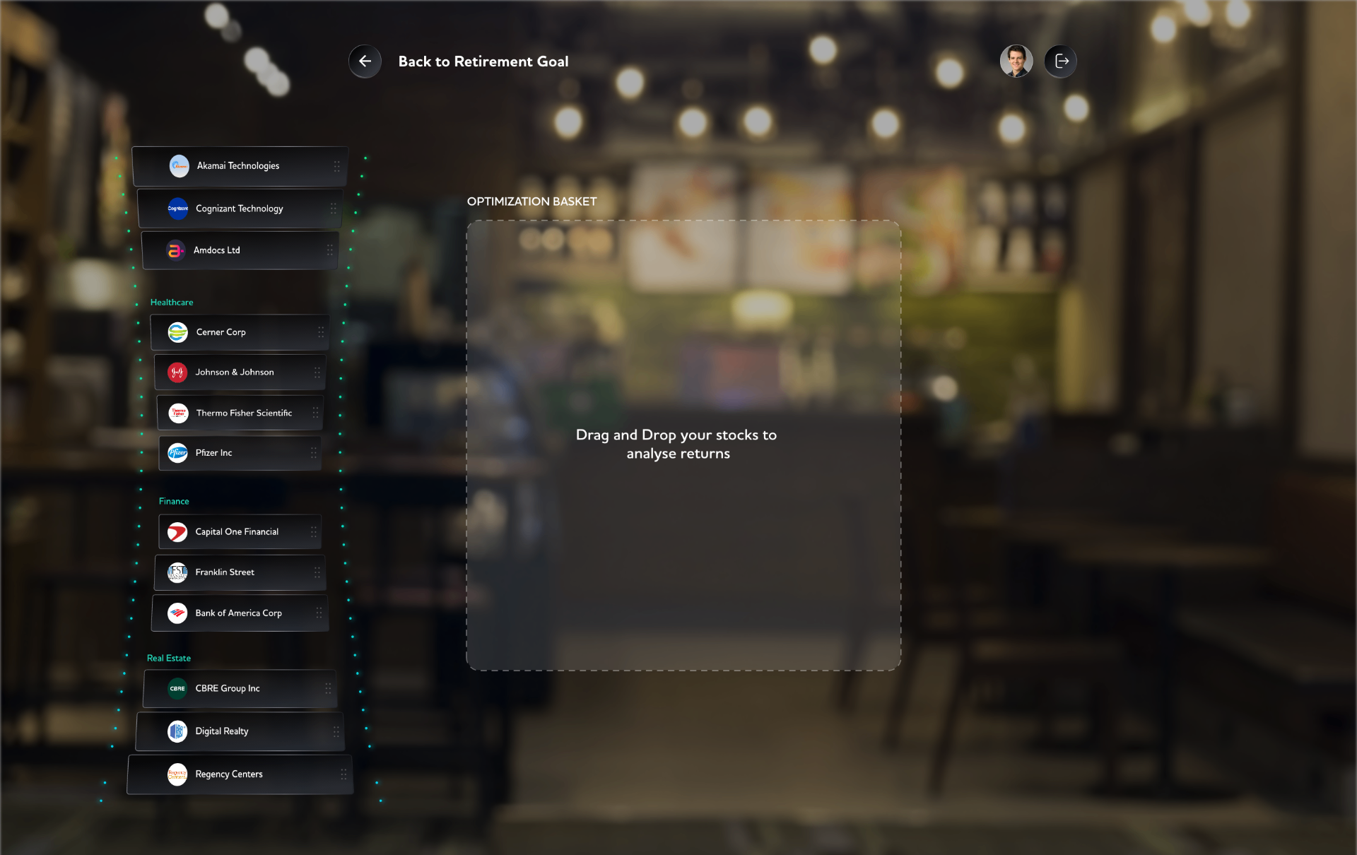
Step 05
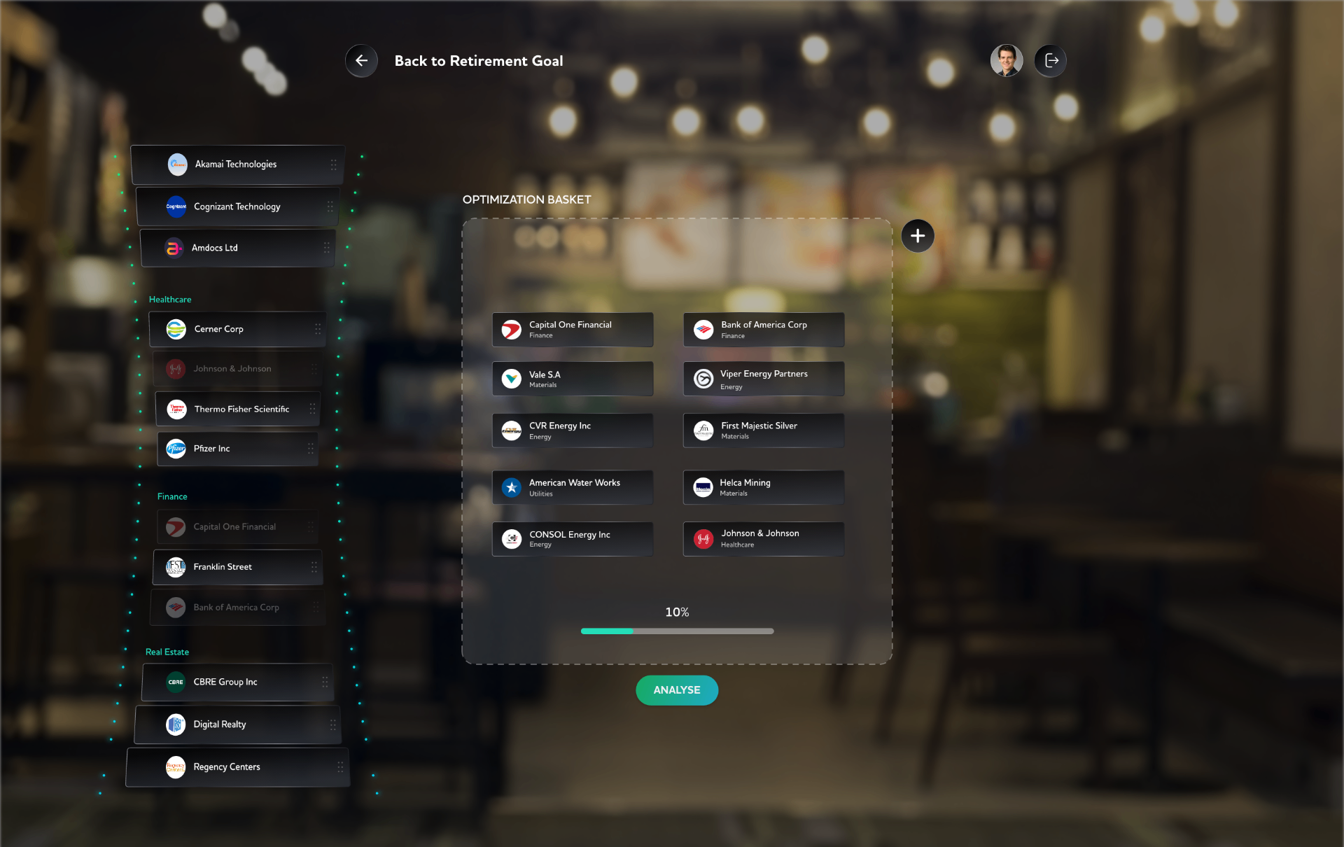
Holdings drop into a basket that fills toward 100% — a tangible progress bar for an invisible decision.
Step 06
The basket previews the sector mix as stocks are added. Rebalance by dragging back — muscle memory, not spreadsheets.
Step 07
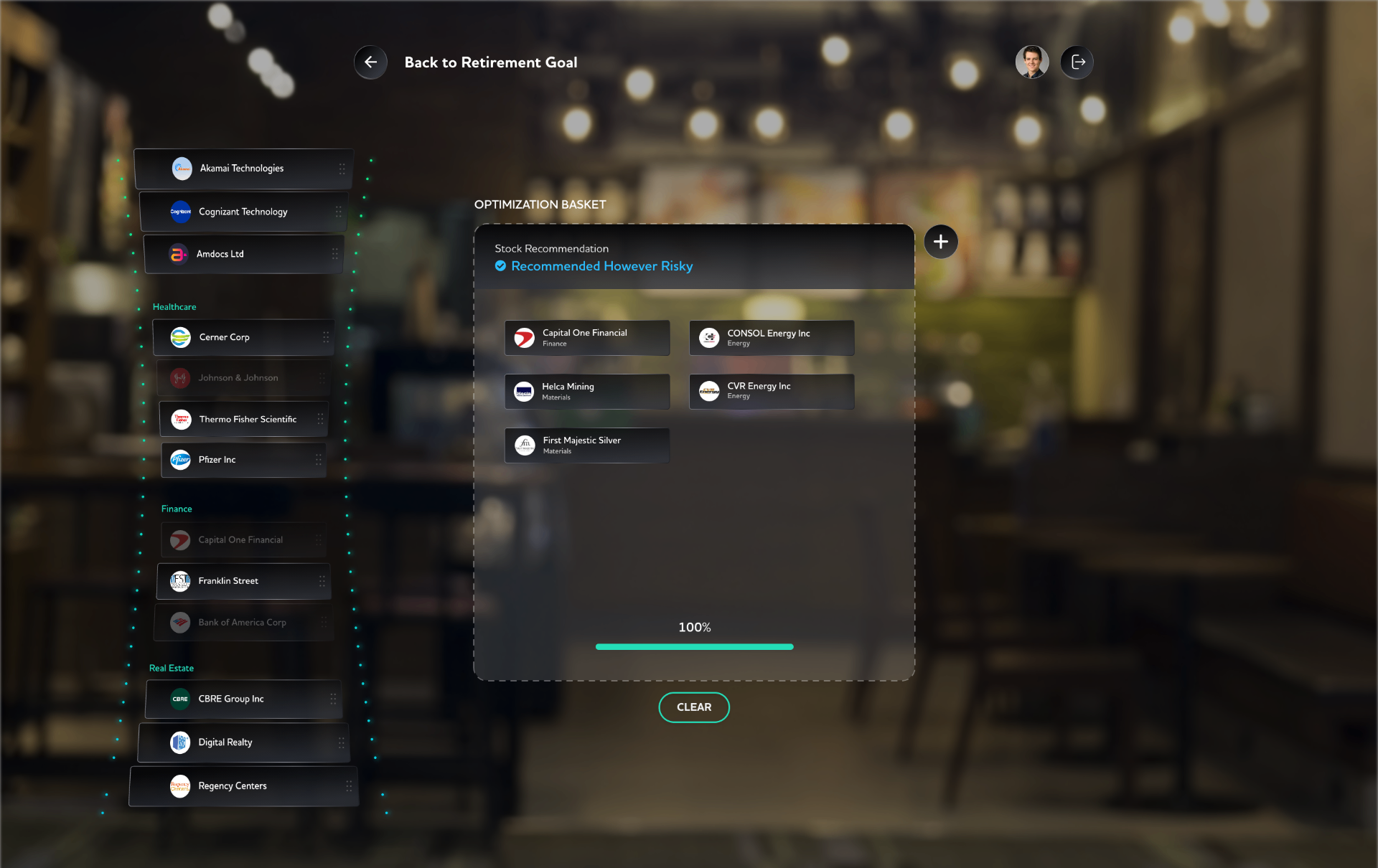
At 100%, the system labels the basket — 'Recommended However Risky' — and shows the pruned list. Transparent, not marketing-safe.
Conversation
Panels answer what. A conversation answers why. So the goal panel opens into a spoken exchange — the customer asks in plain words, and each reply lands as a verdict plus one small card they can act on.
Goal advisor
Retirement · target age 58
Reflection
The medium changes the message. The moment you stop treating a bank as a page and start treating it as a room, you stop asking “what fits on the screen?” and start asking “what does the customer need to see at eye level?”
The result is fewer modules, more silence between them, and a product that feels less like a tool and more like a place — which is what a bank was always supposed to be.