01
Seven disconnected tools with no shared truth
How we overcame it: Collapsed into one canvas where configuration, sector mapping and NDVI intelligence live together — one query, one answer.
Case Study · 2024
Aeris is a cloud workspace that unifies configuration management, sector mapping and NDVI intelligence for Apex Renewables — one hosted instance serving teams across Germany and multiple global sites, replacing spreadsheets, tribal knowledge and a tangle of disconnected desktop tools.
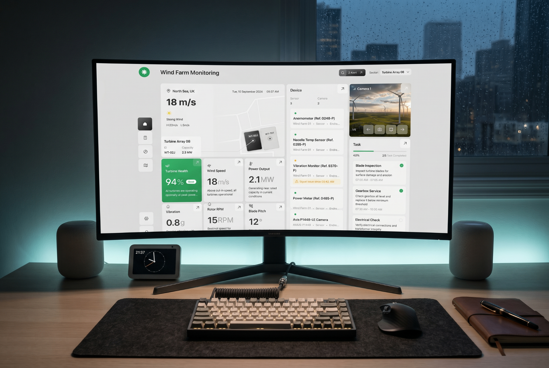
This case study covers the end-to-end UX redesign of Aeris — a cloud platform that unifies wind-turbine configuration and precision-agriculture operations in one browser workspace. Multi-tenant, role-scoped and live for every site, it spans research, information architecture, interaction design and a design system that replaced seven disconnected desktop tools and spreadsheets with a single, always-current source of truth.
Problem Statements & How We Overcame Them
These were the real obstacles discovered during research — and the design moves that removed them.
Seven disconnected tools with no shared truth
How we overcame it: Collapsed into one canvas where configuration, sector mapping and NDVI intelligence live together — one query, one answer.
Configuration data re-entered across NPI, MLA and wind-farm teams
How we overcame it: A single, auditable source of truth with role-based CRUD so every team writes to the same record without overwriting.
Three versions of the same spreadsheet — no one knew which was current
How we overcame it: Versioning and provenance built in: every value is traceable to PLM, SDM, MLA or human approval with a timestamped trail.
Field intelligence (NDVI, soil, weather) separated from asset data
How we overcame it: Agritech lenses overlaid directly on the configuration canvas — a blade-load change and a crop-stress anomaly can be reasoned about in one viewport.
Tribal knowledge trapped in one engineer's macros
How we overcame it: Loads envelopes, approval rules and notification triggers turned into documented, accessible workflows owned by the system, not a person.
Land owners and engineers lack AI-driven site feasibility analysis
How we overcame it: Unified AI site intelligence that evaluates land topography, wind potential, water tables and environmental constraints in one canvas — turning weeks of manual assessment into minutes of data-driven insight.
AI Site Feasibility Workflow
A land owner offers a plot. An engineer needs to know if it can carry turbines — safely, profitably, and inside every environmental line. The AI workflow collapses weeks of siloed assessment into minutes of grounded, cited insight.
Inputs — four data domains ingested in parallel, each with provenance.
Pipeline — five deterministic stages, every step auditable.
Output — one feasibility report the developer, financier and regulator can all read.
Land owner drops a KML / parcel ID. Engineer connects data sources. Pipeline pulls satellite, ERA5 wind, hydrology and cadastral layers in parallel.
Rasters resampled to a 30m grid, reprojected to a shared CRS, and gaps filled with kriging. Every value carries a provenance token.
AGL wind extrapolation, wake losses, flood inundation, glare and NDVI seasonality models run as a DAG — each cell scored independently.
Weighted composite: Wind (35%) · Land (25%) · Water/Flood (20%) · Environment (20%). Sensitivity sliders let the engineer re-weight live.
One-click site feasibility PDF: AEP forecast, LCOE band, buildable-area polygon, risk register, permit checklist, and comparable-site references.
AEP
142 GWh / yr
Annual energy production, P50
Capacity Factor
38.4%
Class II wind regime
Buildable Area
68% of parcel
After setbacks & exclusions
Flood Risk
Low
100y return outside pad zones
LCOE Band
€42–48 / MWh
Merchant + PPA blend
Permit Confidence
High
No protected-species conflicts
Every figure links back to the source layer, model version, and confidence band — so a reviewer can trace an AEP number down to the exact wind cell and reanalysis timestamp behind it.
01 — Overview
Aeris began as a desktop configuration tool for NPI engineers and was rebuilt as a cloud operations workspace covering sector mapping, health scoring and component-level approvals — one hosted instance, role-scoped, reachable from an office, a site office or a turbine platform without a single file being emailed.
Voice of the customer: “If we're all designing the same wind turbine, why do we all speak different languages?”
01b — Where the cloud does the work
Moving from seven desktop tools to one hosted workspace wasn't a hosting decision — it changed what each screen could promise. These are the points where the cloud model is visible in the product.
Hosted ingestion
Wind, soil, water and satellite feeds stream into one hosted pipeline. No nightly exports, no local copies drifting apart.
Multi-tenant
Every turbine park and farm sector is scoped to its own tenant, so shared components stay global while data stays isolated.
Live truth
A blade-load change made in Germany is visible to the crew on site seconds later, with explicit last-synced and connection states.
Role-scoped access
Roles — not people, not folders — own the truth. Certification fields are writable by certification engineers only.
Elastic compute
Terrain, wind-yield and NDVI models run on hosted compute, so a full site study finishes in a browser tab rather than an overnight desktop job.
Browser-native
Nothing to install. The same URL, the same record, the same vocabulary — on desktop in the office and tablet in the field.
02 — The Problem
Configuration lived in PRD matrices, LC databases, FlexModel parameter files and WT_conf_master spreadsheets — all on individual machines and shared drives. Engineers re-keyed the same data across hand-offs, and no one could agree on the latest blade load envelope.
Component data re-entered across NPI, MLA and wind-farm teams.
Three answers to one question depending on whose local file you opened.
Configuration changes took weeks to reach simulation owners.
Site crews had no access to the tools at all — only printouts and phone calls.
“I'm an RCA engineer — what's the original blade load envelope? The latest controller updates for this config? No idea. Wtconfmaster#??? I only speak in PRD#!!!”
03 — Discovery
14 stakeholder interviews across NPI, MLA, certification, PLM and wind-farm engineering. Two AS-IS journey maps, one TO-BE journey, a persona–data–process matrix and a pain-point catalogue per role.
04 — Decision Frame
Four questions framed every design move — how the problem was defined, why this shape over the alternatives, what was traded away, and why the result doesn’t look like anything else in the category.
How I defined the problem
Stakeholders described the pain as ‘seven systems.’ Discovery reframed it: the real problem was that no two local systems agreed on the current configuration. I rewrote the brief from ‘consolidate tools’ to ‘establish one cloud-hosted, auditable source of truth that every persona can write to within their access.’ That reframe unlocked the entire IA.
Why this solution over alternatives
We weighed three options: (a) an integration layer that left the seven desktop UIs intact, (b) a dashboard-only ‘viewer’ over the existing tools, (c) a single cloud canvas that owned configuration and surfaced field intelligence side-by-side. We chose (c) because the engineer’s real job is a decision, not a lookup — and only one hosted canvas let configuration changes and field outcomes inform each other in real time, for every site at once.
The trade-offs I made
Owning the schema meant three legacy reports had to be rewritten and four teams gave up bespoke spreadsheets. The CRUD matrix is intentionally narrow — Loads Engineers cannot edit certification fields, even though the old Excel let them. And v1 shipped online-only: syncing a configuration source of truth offline would have undermined the very trust the cloud model was there to build, so instead we designed explicit connection and last-synced states.
How it’s different from other tools
PLM tools (AssetVault, TeamVault) own configuration but ignore the field. Precision-ag tools (FieldSense, CropMind) own the field but ignore the asset. Aeris is the only hosted surface where a blade-load envelope change and an NDVI anomaly can be reasoned about in the same workspace, by an engineer in Germany and a crew on site — because for this operator, they are the same decision.
04 — Design Principles
Configuration, sectors and loads share the same surface — never a separate tool.
Every card answers: is this healthy, who owns it, what changed?
Every value is traceable to its source — PLM, SDM, MLA or human approval.
Alerts only when an action is required. No dashboards-as-noise.
05 — Information Architecture
A login lands in a configuration dashboard; from there, every path (Details, Plant, Task, Device, Activity) maps to a microservice and an owner. Notifications follow the work, not the role.
06 — Personas
Each role writes to the same record — but only within the scope of their access. Roles, not people, own the truth.
Owns the source of truth for a config revision.
Builds new configs from certified components.
Runs loads simulations against a config revision.
Validates loads envelope and operability.
Validates loads against physical components.
Pushes BOM changes upstream into simulations.
07 — The TO-BE Journey
Configuration Owner spins up a revision; PLM data flows in.
NPI selects components; constraints validate live.
MLA runs loads against the revision in SDM.
Certification signs off; envelope locks.
PBM owners validate loads against physical components.
08 — The Designs
Each surface is a window onto the same underlying data — sectors, plants, devices, loads — viewed through the lens that matters now.
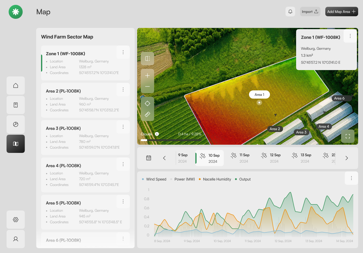
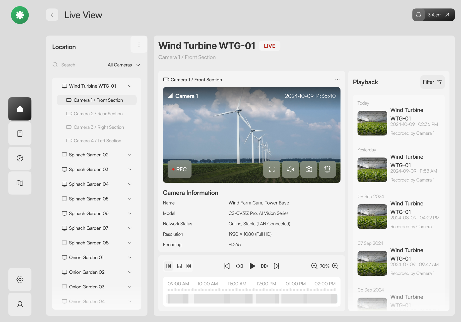
A split view pairs structured sector data with a live aerial scene. The Section 3 popover surfaces health, soil, humidity and a 7-day trend without leaving the map.
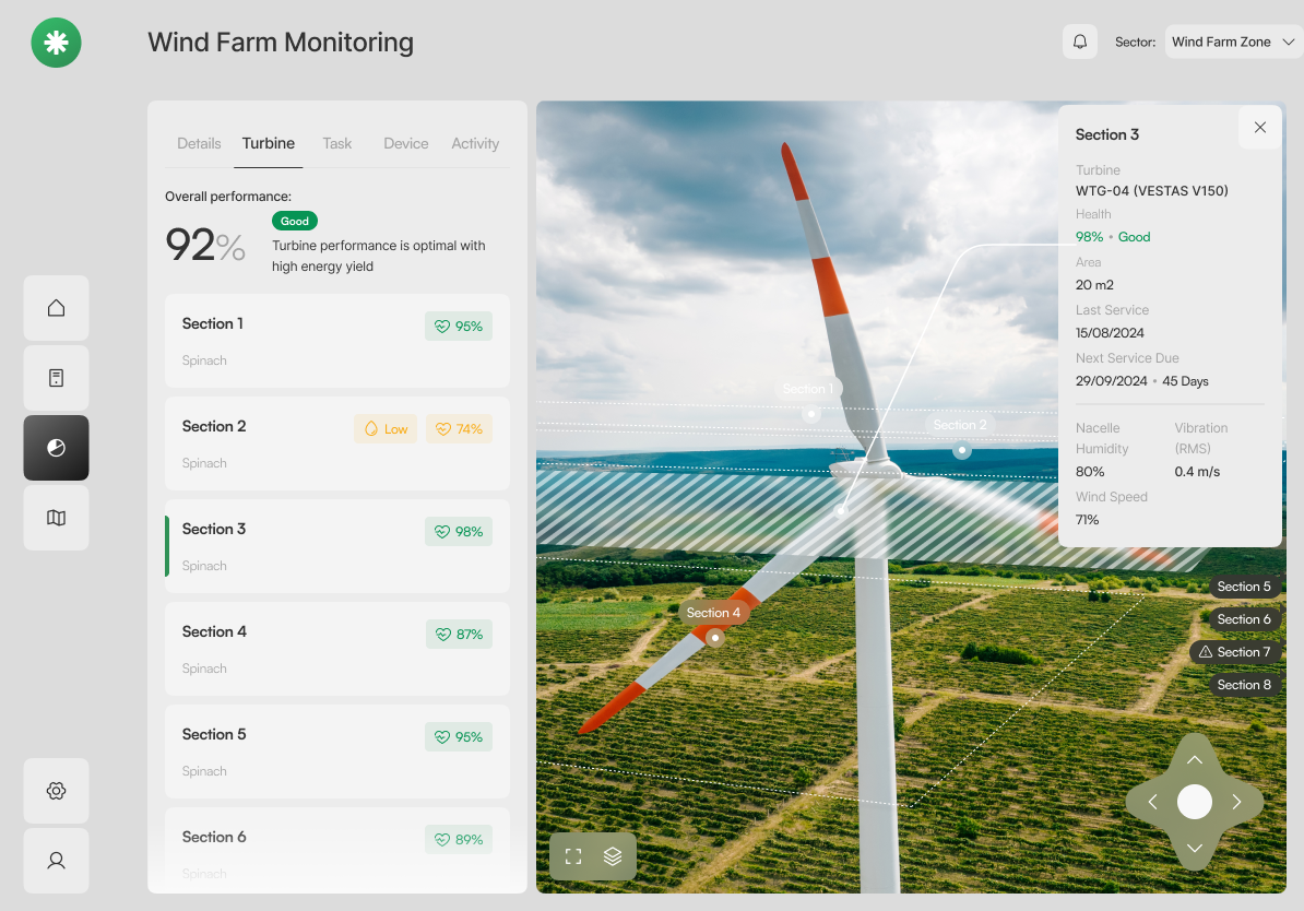
The same canvas tuned for embedded contexts: chrome shrinks, content stays. One layout, two densities — proof the system scales without redrawing.
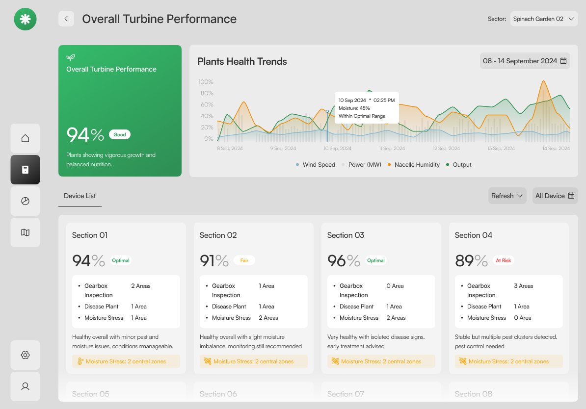
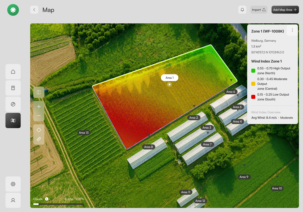
A precision-agriculture lens on top of the configuration canvas. NDVI zones (healthy · moderate · stressed) read at a glance; the legend is the explanation.
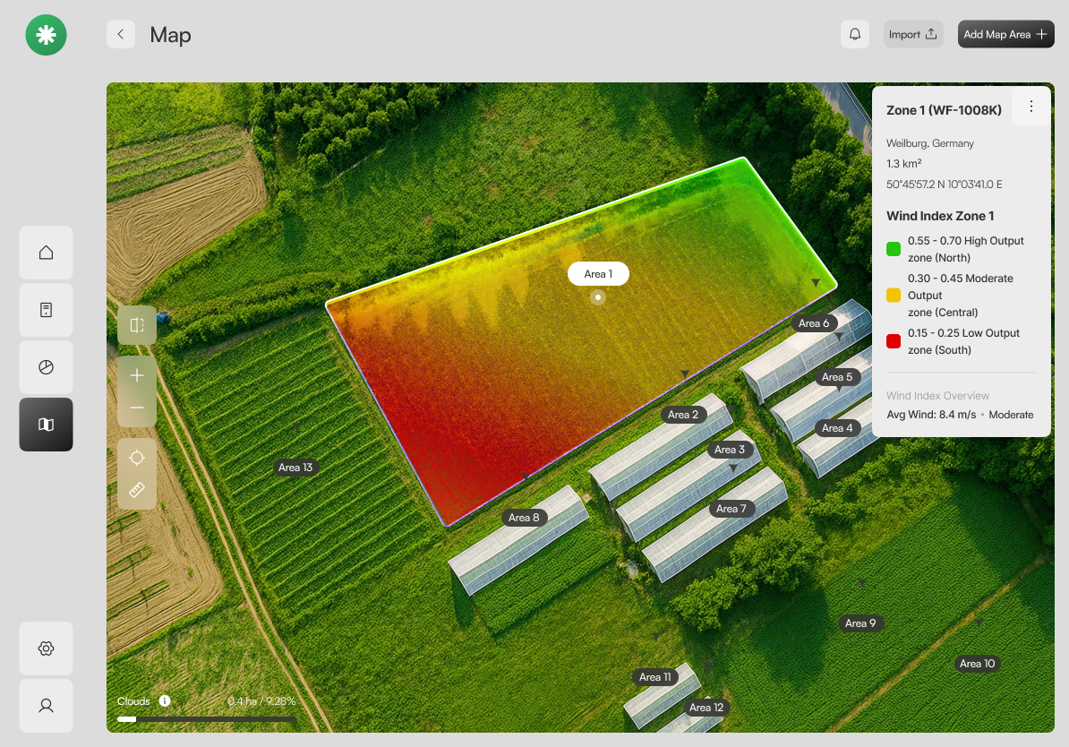
Every map area is a card with location, land area and coordinates. A date strip and metrics chart anchor the temporal view — soil moisture, precip, humidity, growth.
A focused dialog with progressive disclosure: name first, then boundary file, then coordinates. The Create button stays disabled until the area is geometrically valid.
09 — Design System
Greens grounded in soil and leaf, accented by warning amber and a quiet sky blue. Fraunces sets the editorial tone; Inter carries the data; JetBrains Mono for coordinates and IDs.
Process Artifacts
Architecture maps, journey flows, the product roadmap, and the persona-access matrix that shaped Aeris before pixels were pushed.
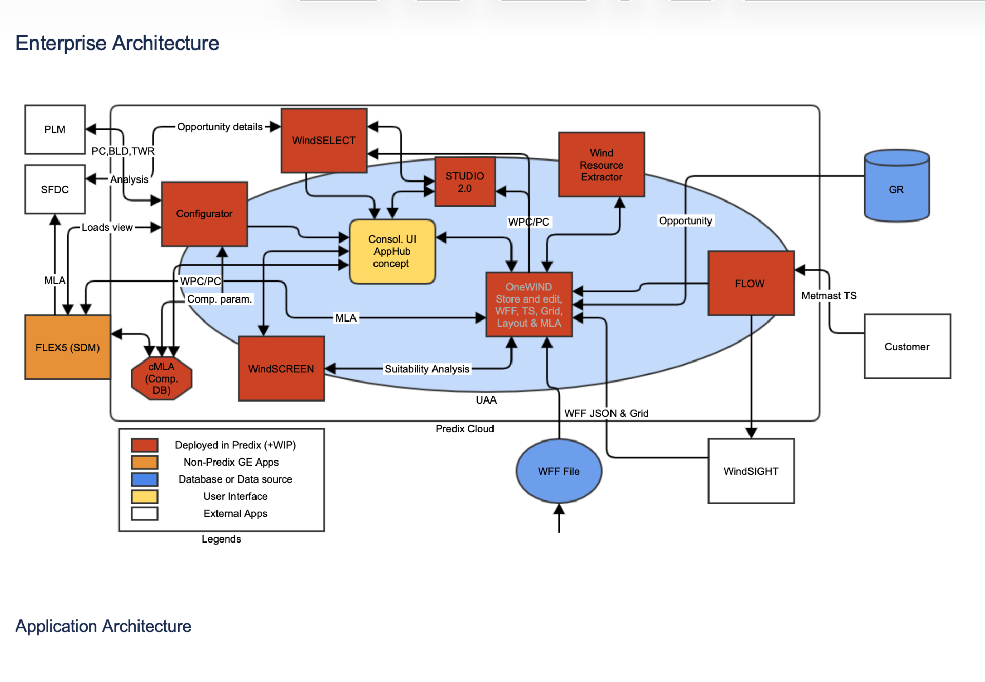
Enterprise Architecture
Before a single screen was drawn, we mapped the full Apex Cloud ecosystem — Configurator, WindHub, Studio Canvas, FlexModel, LeaseCalc, FlowMap — and the data exchanges between them. This artifact gave the team a shared vocabulary and made the integration seams (PLM, CRM Core, Wind Data Engine) impossible to ignore.
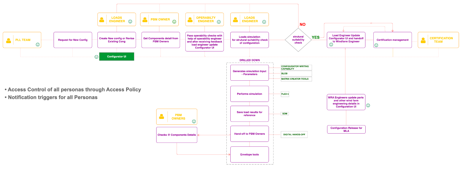
Journey Map
From the PLL Team's request for a new config, through Loads Engineer, PBM Owner, Operability Engineer, and on to Certification — with the drilled-down tooling (FLEX 5, SDM, Matrix Creator, Envelope tools) called out at each step. Access policy and notification triggers are surfaced as cross-cutting concerns.
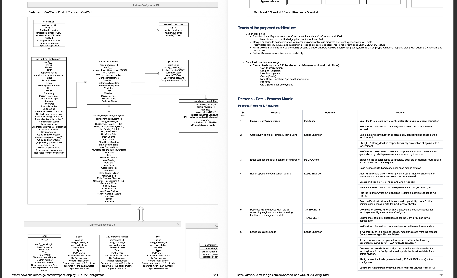
Product Roadmap & Data Model
The proposed architecture tenets (seamless UX, microservices, scaling existing component DB) sit alongside the turbine configuration DB, components subsystem, and a 15-step Process × Persona × Action matrix that became the backbone of every subsequent sprint.
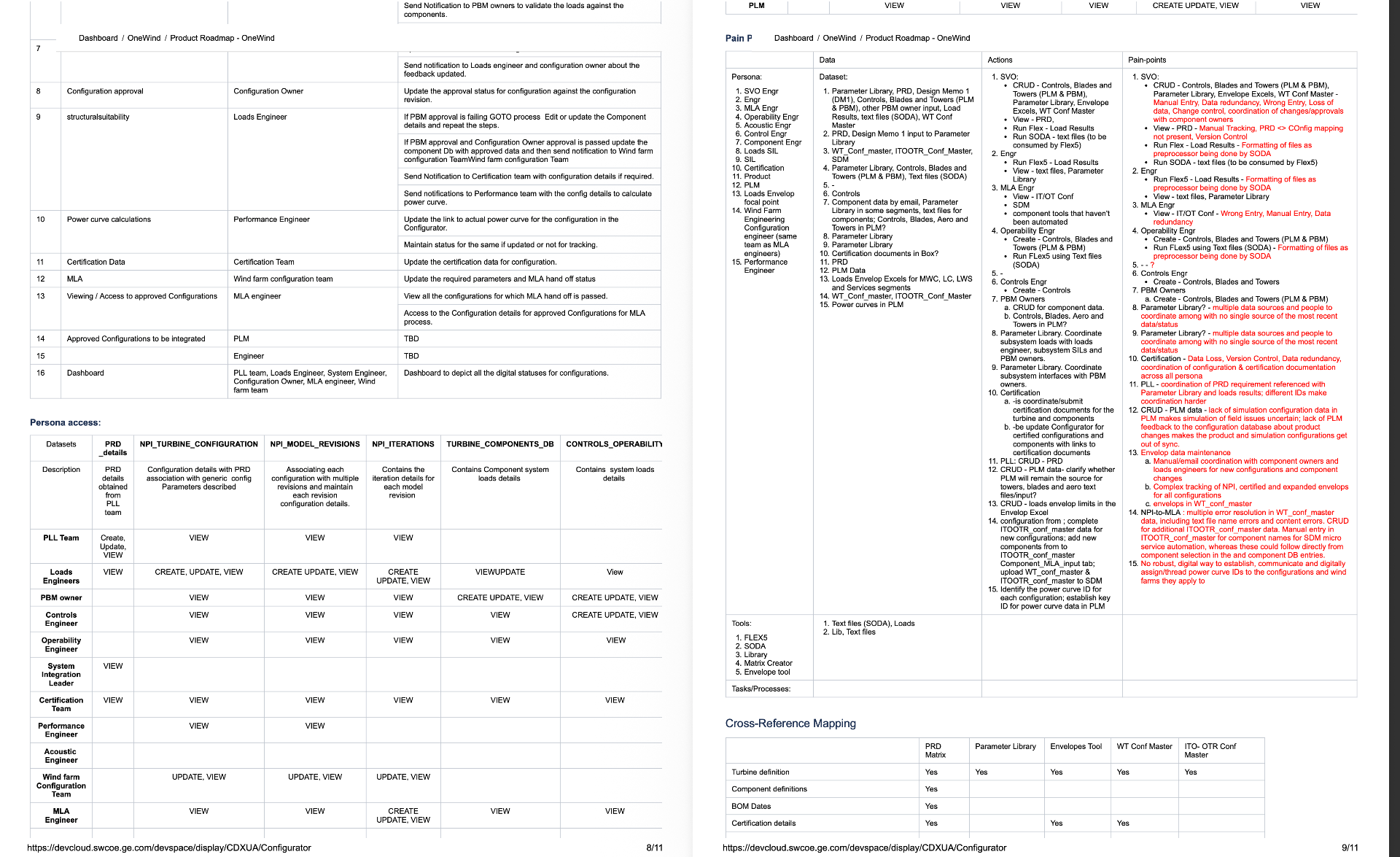
Persona Access & Pain Points
A CRUD access matrix across PLL Team, Loads Engineer, PBM Owner, Controls, Operability, System Integration, Certification, Performance, and MLA engineers — paired with a Data / Actions / Pain-points table that captured the manual entry, version control gaps, and coordination overhead the new system had to eliminate.
Screens · Problem & Solution
For each core screen — what we observed in research, and the design move that resolved it.
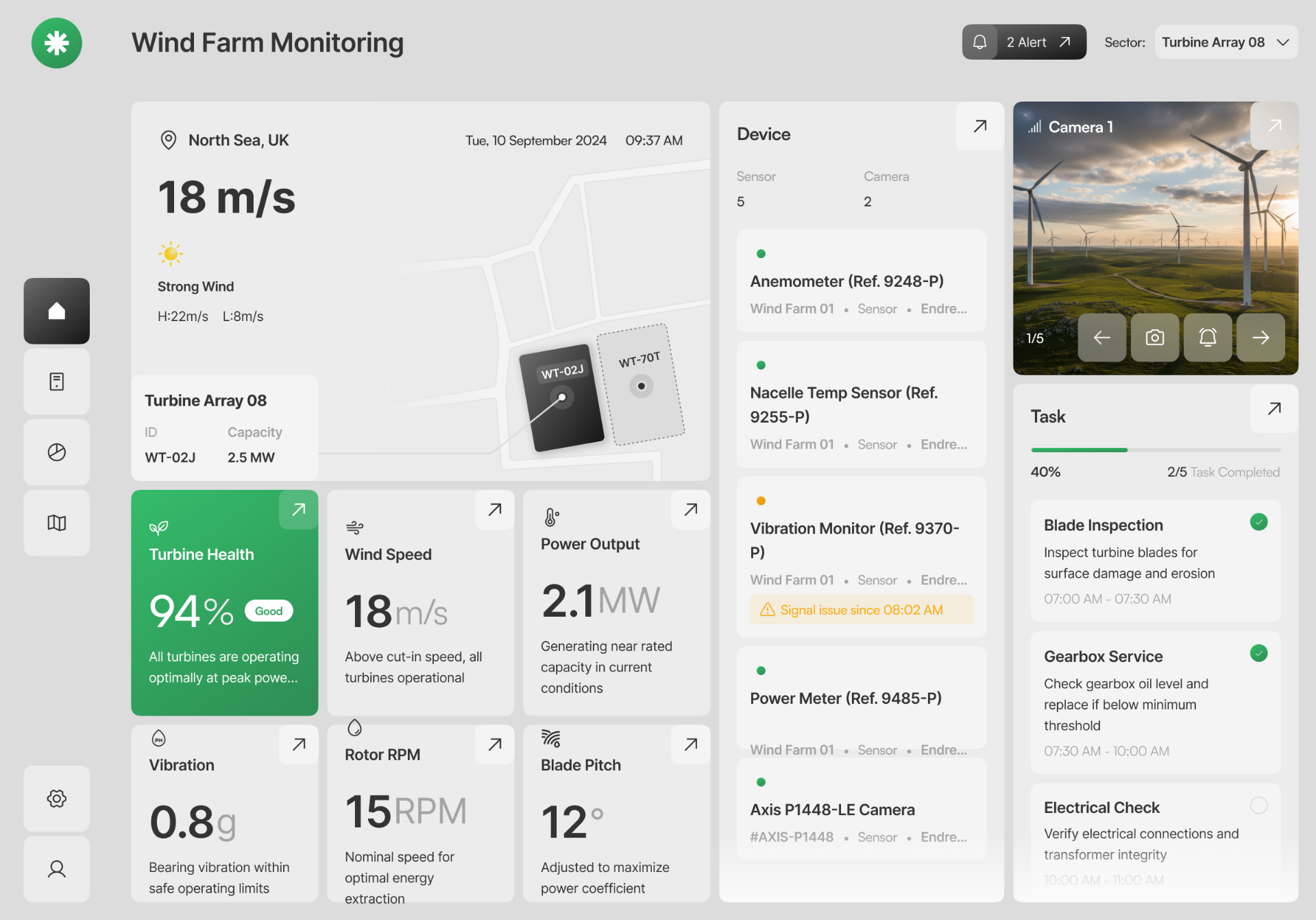
The Problem
Farm managers jumped between 4–5 tools to see weather, sensors, camera feeds and daily tasks. Critical signals — a humidity sensor going offline, a watering window closing — were buried in separate dashboards, so problems were caught late.
How We Solved It
Collapsed the operational picture into one screen organised by mental model, not data source: field context on the left, device health in the middle, live camera and today's tasks on the right. A single Plant Health score acts as the at-a-glance verdict, and inline 'Signal issue since 08:02 AM' badges surface faults where they're relevant.
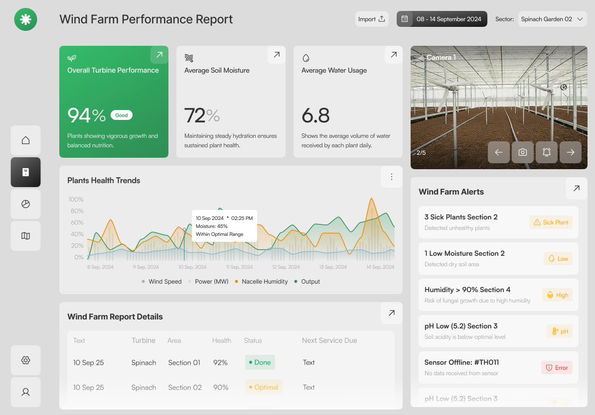
The Problem
The legacy system fired every alert with the same red urgency — a low battery looked identical to three sick plants. Managers learned to ignore the bell, and real issues slipped through.
How We Solved It
Alerts grouped by domain (Plant Health, Environmental, Soil, System) and triaged into three columns — Optimal, Fair, Error. Each card carries a status chip and a recommended Action, so severity and next step read in the same glance.
The Problem
Agronomists received raw NDVI exports as CSV or PDF. Interpreting them meant matching coordinates to plots by hand, and stressed zones were often identified days after the damage was done.
How We Solved It
Rendered NDVI directly on the satellite view with a three-band legend (Healthy / Moderate / Stressed) and per-area overlays. Selecting a zone reveals coordinates, size and average index in a side panel — a 2-second read instead of a spreadsheet exercise.
The Problem
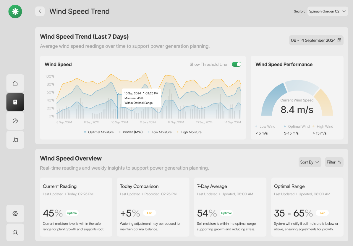
Irrigation decisions were made on a single current reading. Without context, teams over-watered on cool days and under-watered after heatwaves — both hurt yield.
How We Solved It
A 7-day band chart plots moisture against the optimal range and precipitation, with a gauge for the current reading. Four supporting tiles make the recommendation defensible: irrigate, hold, or reduce — with the evidence visible.
The Problem
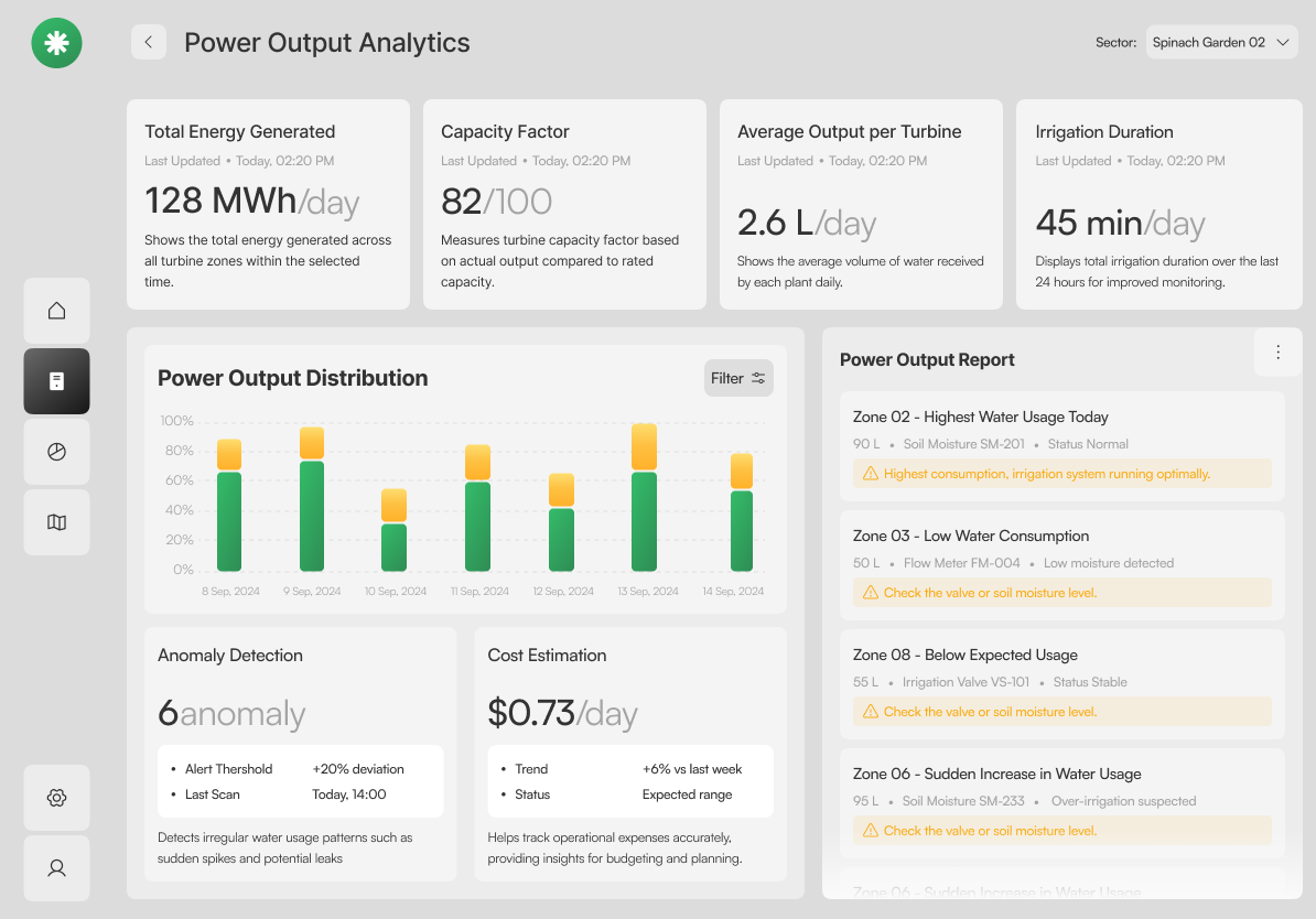
Water was the largest operating cost, but usage data lived in the irrigation controller and cost data lived in finance. No one could answer 'which zone is leaking' without a half-day investigation.
How We Solved It
Consumption, efficiency score, per-plant average and irrigation duration sit above a per-day distribution chart. An Anomaly Detection card flags deviations and the Water Usage Report lists offending zones with a one-line cause.
10 — Outcomes
NPI configuration cycle time
Tools collapsed into one canvas
Cross-team approval velocity
Spreadsheet-of-truth dependencies
10b — My role, decisions & impact
NPI configuration cycle time
Tools collapsed into one hosted canvas
Cross-team approval velocity
Spreadsheet-of-truth dependencies left
Measured across the 12-week pilot against the pre-launch baseline.
11 — Reflection
The hardest part wasn't the UI — it was getting six disciplines to commit to one vocabulary. Next time, I'd run the persona–data–process workshop in week one, not week six.
Bringing the NDVI layer into the same canvas late in the project paid off; it proved the system could absorb adjacent products without breaking. That argument unlocked the next funding round.