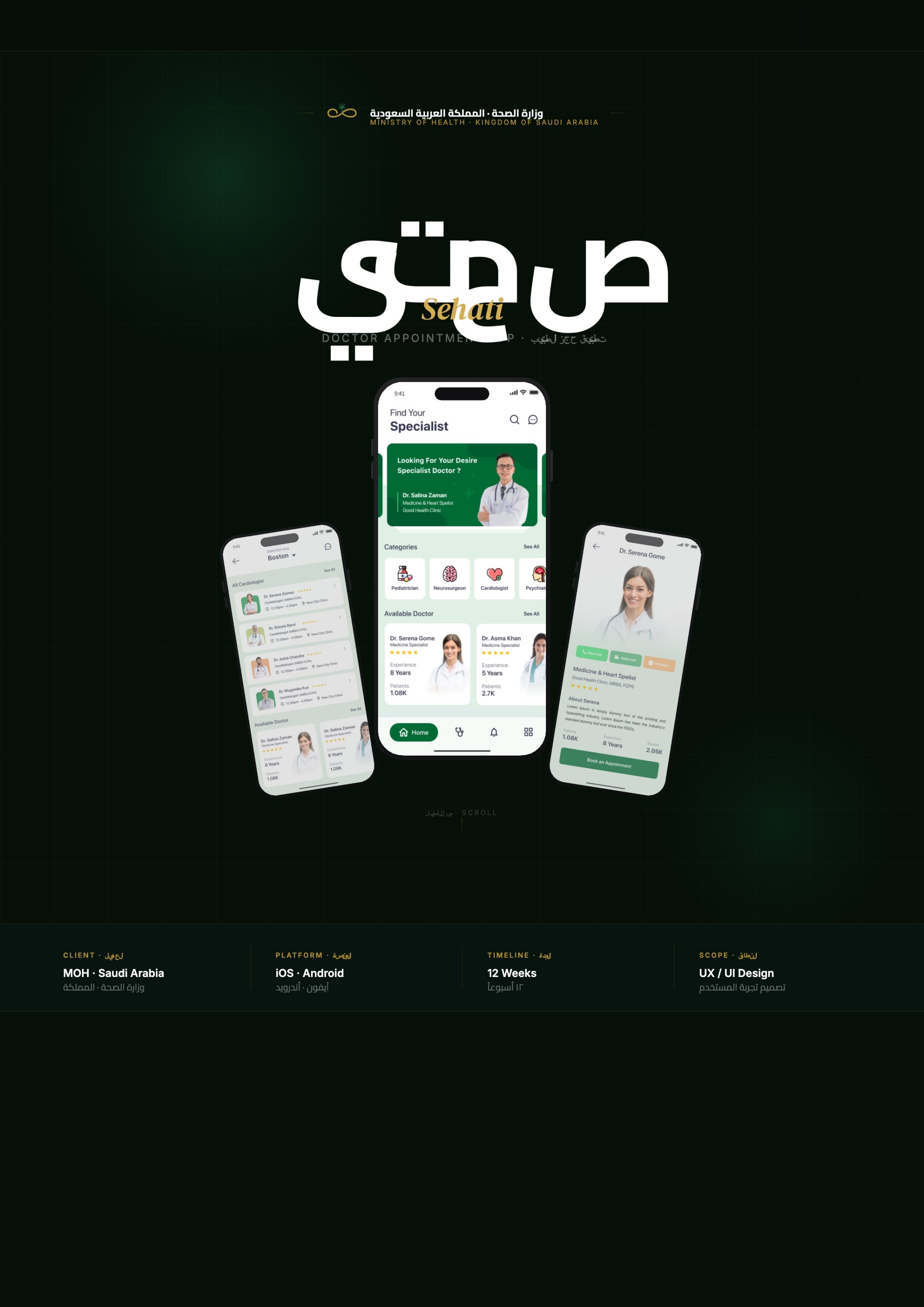
01 · Cover · الغلاف
One app for the whole patient journey
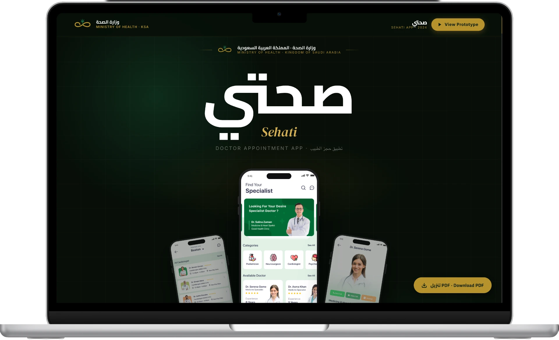
The identity pairs an editorial Arabic display face with a calm green canvas, setting a clinical-but-warm tone before a single screen appears.
Brand toneBilingual identity
Doctor appointment app · تطبيق حجز الطبيب
Patients faced fragmented access to specialist care: long queues, unclear availability and no digital follow-up. Sehati was commissioned as part of a national digital-health agenda to unify the appointment experience end to end — bilingual, mobile-first, and calm enough for a first-time user.
Client
National Health Ministry (public sector)
Platform
iOS · Android
Scope
UX / UI design, bilingual system
Year
2024
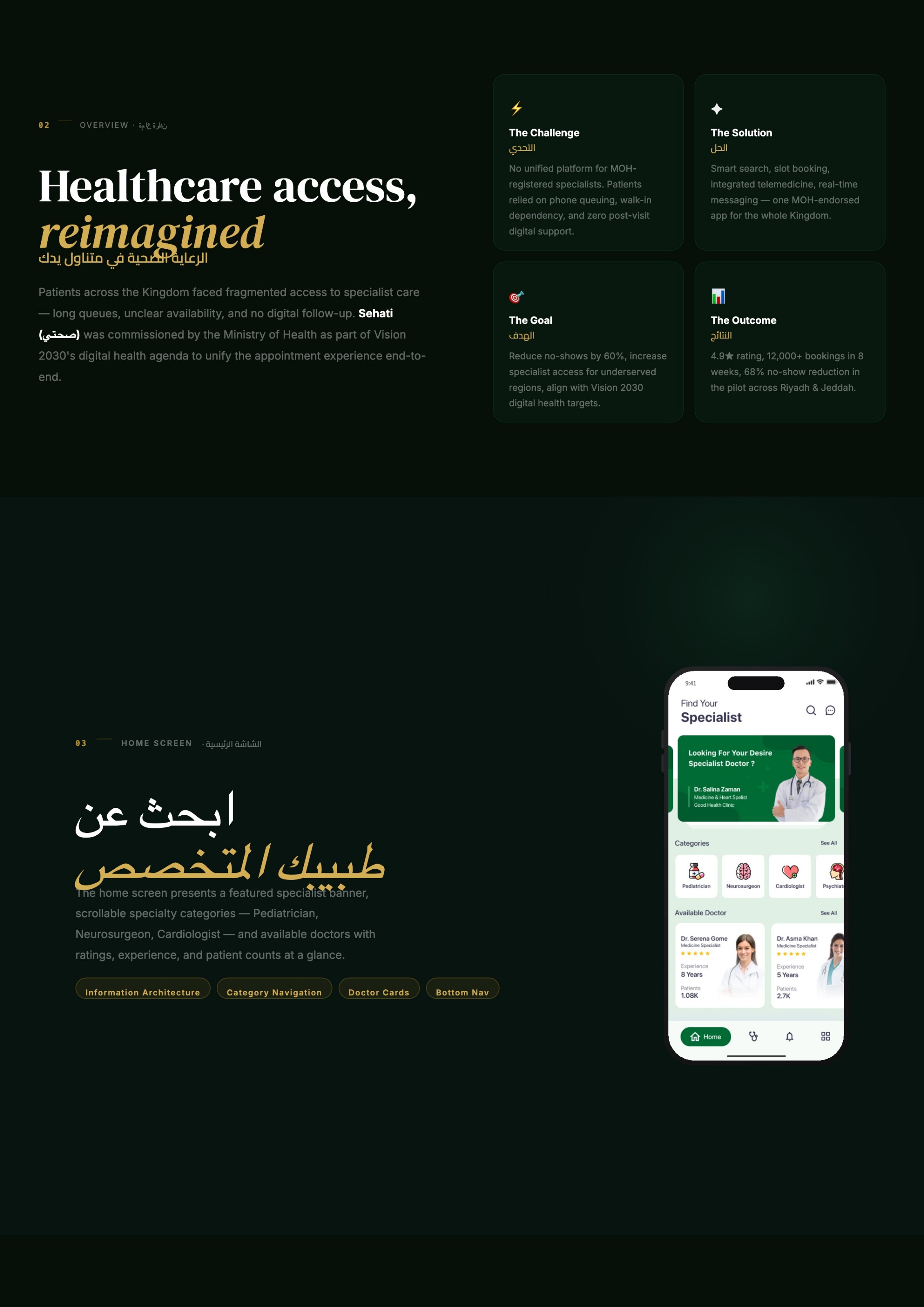
No unified platform for registered specialists. Patients relied on phone queuing, walk-in dependency and zero post-visit digital support.
Smart search, slot booking, integrated telemedicine and real-time messaging — one endorsed app for the whole country.
Cut no-shows by 60%, widen specialist access for underserved regions, and align with the national digital-health agenda.
4.9★ store rating, 12,000+ bookings in eight weeks, 68% no-show reduction across the two-city pilot.
Problem statement
Availability lived with clinic receptionists, not with patients. People called multiple hospitals, arrived as walk-ins, and lost the thread the moment they left the consultation room. Rural patients absorbed travel cost for visits that could have been remote.
Research & discovery · البحث
Method
18 patient interviews
Capital + two regional governorates, including 5 low-literacy and 3 elderly participants with a caregiver present.
Method
6 clinician shadowing sessions
Watched reception staff juggle a paper day-book, WhatsApp requests and walk-ins during peak morning hours.
Method
Call-centre log analysis
Three months of call reasons: 61% were 'what time is my appointment' and reschedule requests — pure information loss.
Method
Competitive teardown
Nine regional health apps benchmarked on booking depth, RTL quality and how early trust signals appear.
“I call four times to get one appointment, and I still don’t know who the doctor is.”
Design response — Trust is decided before scheduling — so credentials had to sit in the result list, not behind a profile tap.
“I travel three hours, then they tell me the doctor is not in today.”
Design response — Availability must be truthful and time-stamped; a stale slot is worse than no slot, so slots read from live clinic schedules.
“After the visit, I have questions but nobody to ask.”
Design response — The journey doesn’t end at the appointment — post-visit messaging became a first-class flow, not a nice-to-have.
Journey map
Find a doctor
Before
Ask relatives, search Instagram, call the clinic switchboard.
After
Search by area + specialty + date; three trust signals on every card.
Book a slot
Before
Repeated calls, hold music, no written confirmation.
After
Daypart slot groups, one confirm step, instant in-app + push receipt.
Travel & wait
Before
Long journeys with no guarantee the doctor is present.
After
Reminders at 24h and 2h, plus a video option when travel isn’t possible.
Consult
Before
Rushed, nothing recorded that the patient can revisit.
After
In-person or telemedicine with the visit and doctor kept in history.
Follow up
Before
No channel; another call or another walk-in.
After
Per-doctor thread with attachments and a re-book shortcut.
Information architecture
The whole product is one spine: find, decide, book, attend, follow up. Everything else — history, notifications, profile — hangs off it rather than competing with it.
Home
Featured specialist, specialty chips, available doctors
Search
Area · specialty · date — only three required inputs
Results
Comparable cards with rating, experience, patients seen
Profile
Credentials, bio, stats, and voice/video/message strip
Booking
Date strip → daypart slots → single confirm
Confirmation
Receipt, calendar add, reminder schedule
Consult
Arrive in person or join the video room
Follow-up
Thread with the same doctor, re-book in one tap
Case study pointers
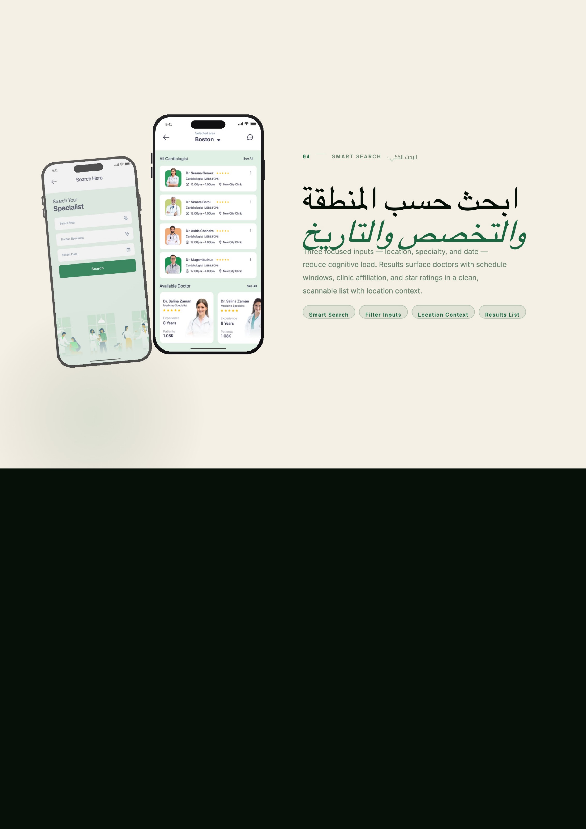
Location, specialty and date are the only required filters. Everything else is progressive — the search form fits above the keyboard on a small phone.
Rating, years of experience and patients-seen sit on every doctor card, so the decision is made in the list rather than deep in a profile.
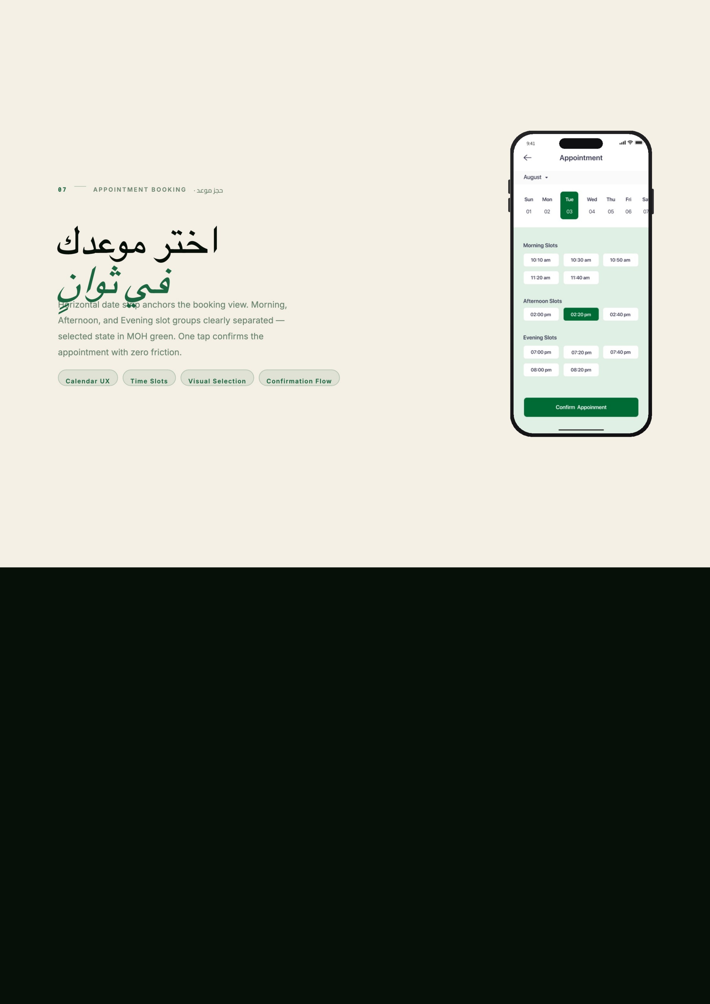
Morning / afternoon / evening groups beat a flat grid of times: patients think in dayparts, and the selected state carries the brand green.
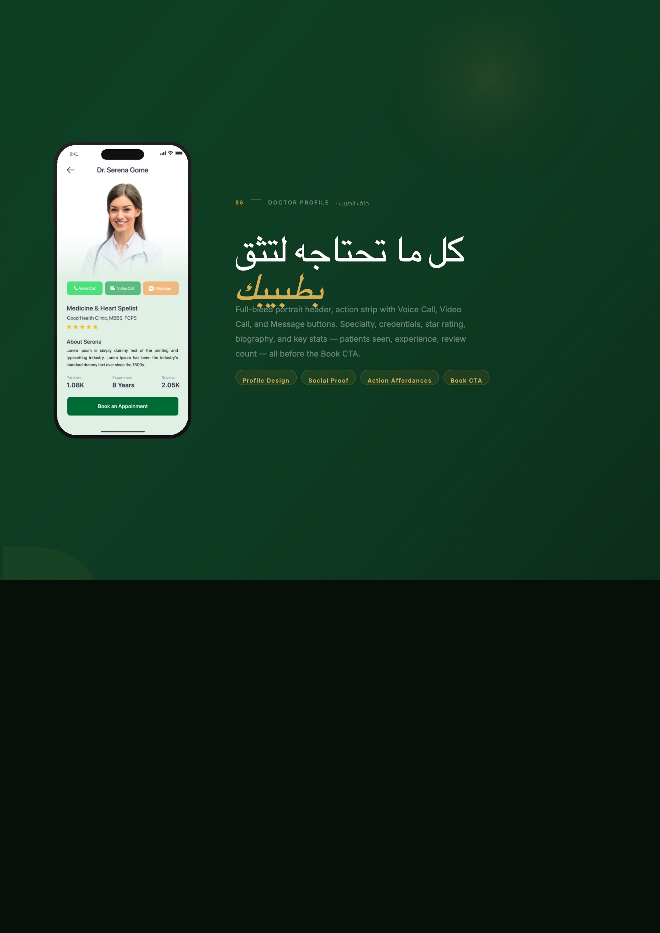
Voice, video and message share one action strip on the profile, so a remote consult is as easy to start as an in-person booking.
Threads per doctor with attachments turn a one-off appointment into continuous care — the gap that drove repeat phone calls before.
Arabic-first RTL and English LTR share one component set: mirrored layouts, numerals and icon direction handled in tokens, not per screen.
Screen walkthrough
01 · Cover · الغلاف
The identity pairs an editorial Arabic display face with a calm green canvas, setting a clinical-but-warm tone before a single screen appears.
02 · Framing · التحدي
Stakeholders across health authorities needed the whole argument in one glance before design detail — this board became the alignment artefact.
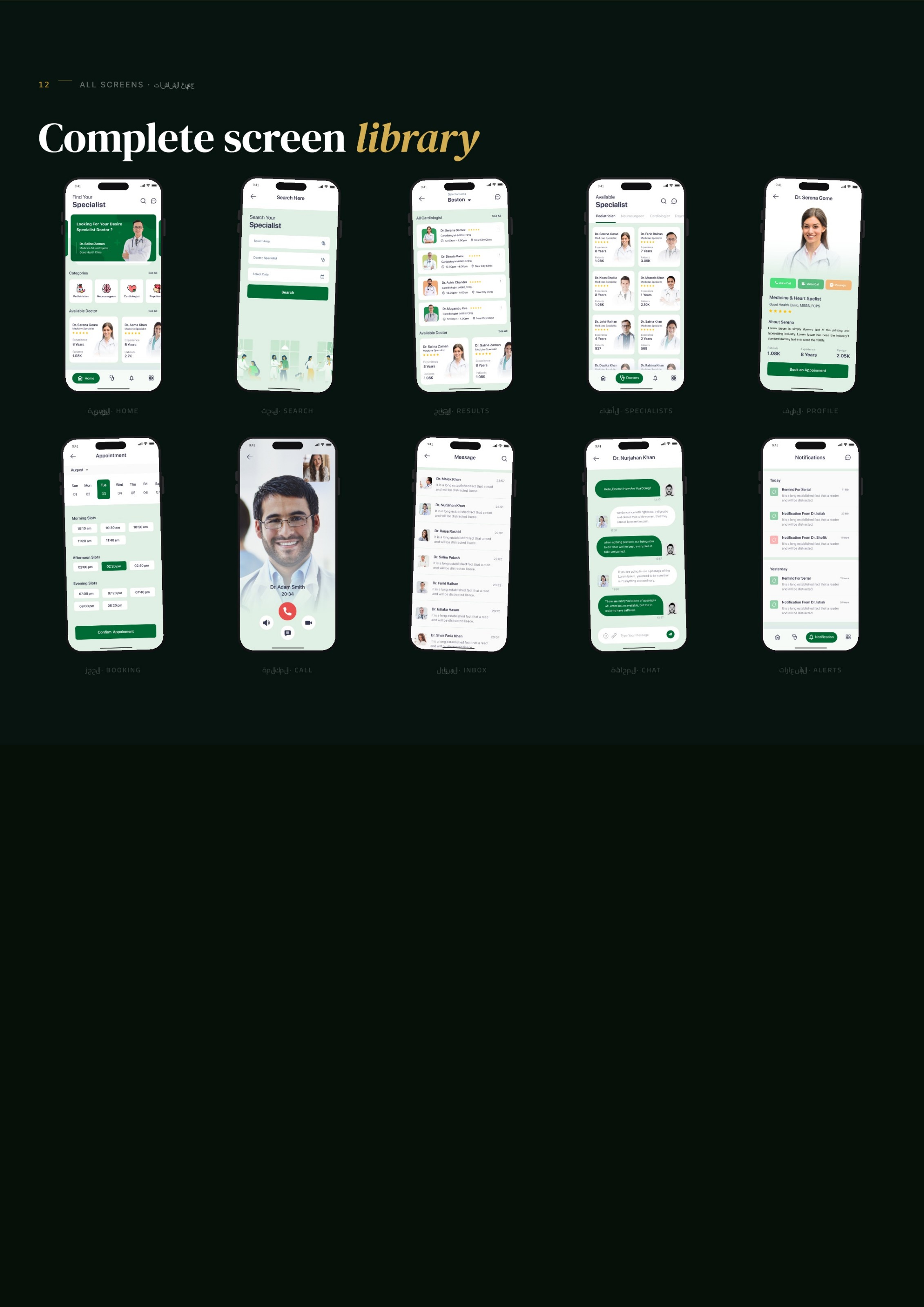
03 · Home · الشاشة الرئيسية
A banner, scrollable specialty chips and doctor cards with ratings, experience and patient counts — the shortest path from open to booking.
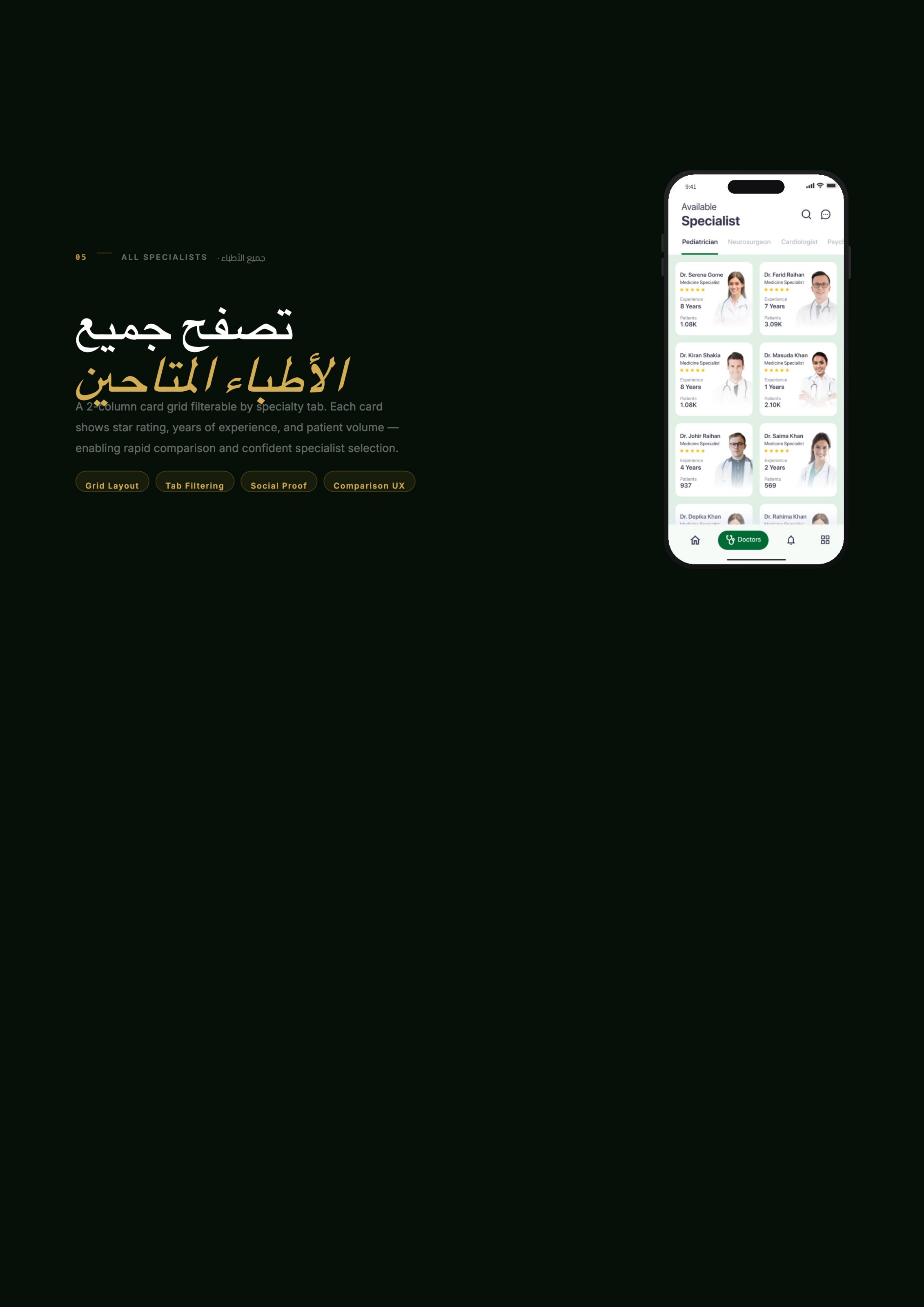
04 · Smart search · البحث الذكي
Results surface schedule windows, clinic affiliation and star ratings in a scannable list that always keeps location context visible.
05 · All specialists · جميع الأطباء
Two-column cards carry the same three trust signals, so comparison happens without opening and closing profiles.
06 · Doctor profile · ملف الطبيب
Full-bleed portrait header, an action strip for voice, video and message, then credentials, biography and key stats — all before the Book CTA.
07 · Booking · حجز موعد
A horizontal date strip anchors the view; daypart slot groups and a single confirm step remove the back-and-forth of phone scheduling.
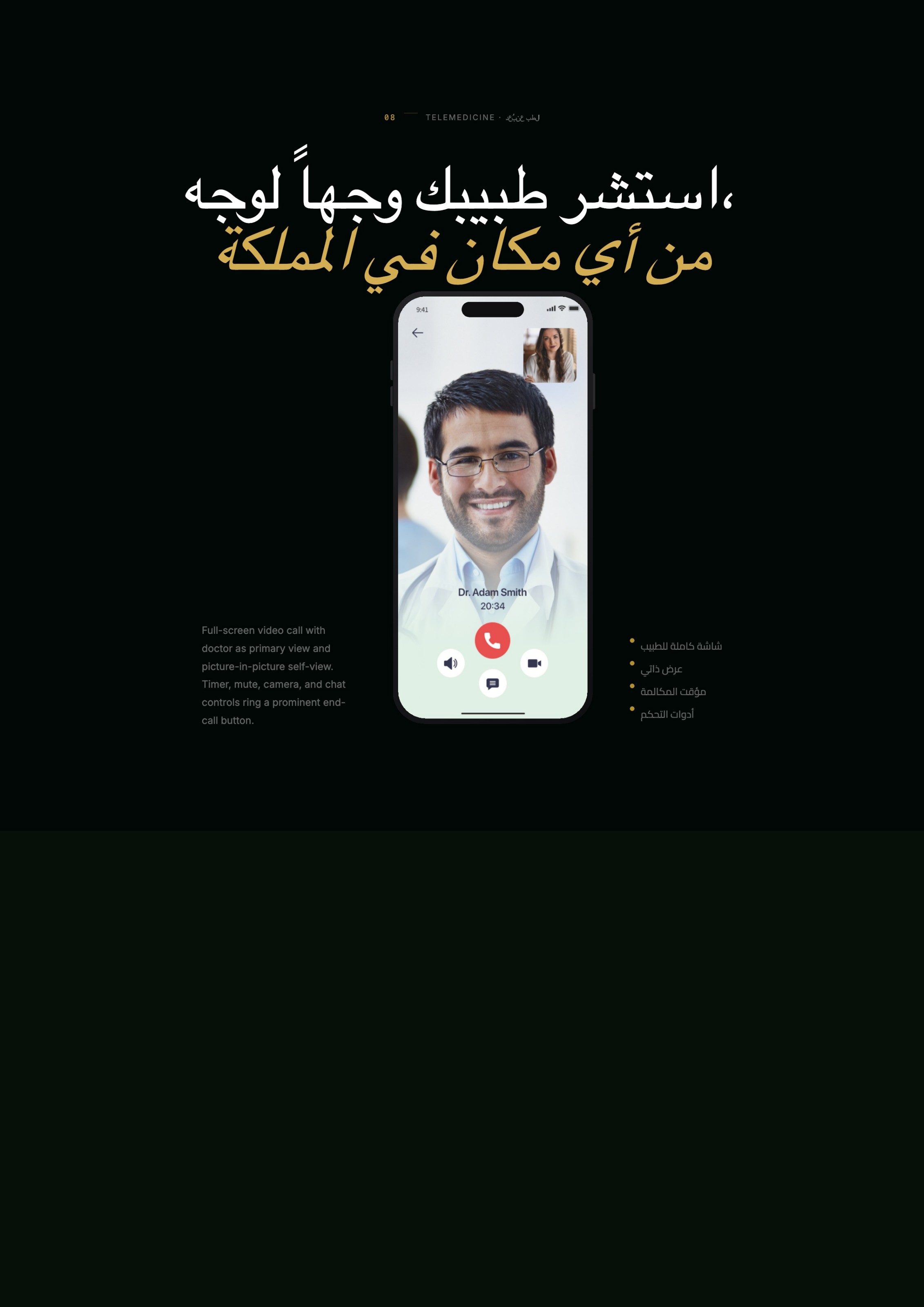
08 · Telemedicine · الاستشارة
Doctor full-screen with picture-in-picture self view; timer, mute, camera and chat ring a prominent end-call control.
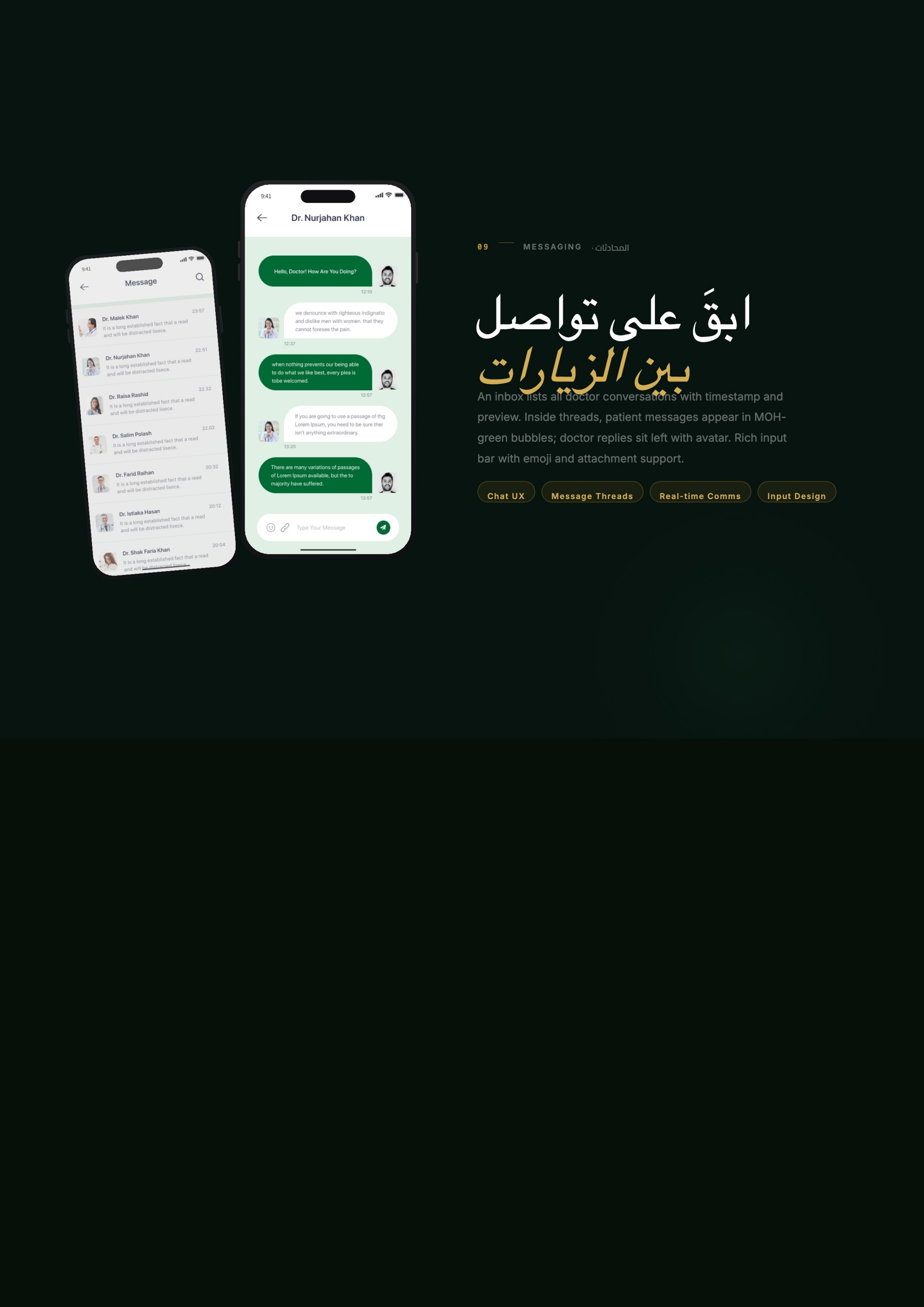
09 · Messaging · المحادثات
An inbox previews every thread; inside, patient bubbles carry the brand green while replies sit left with an avatar, plus emoji and attachments.
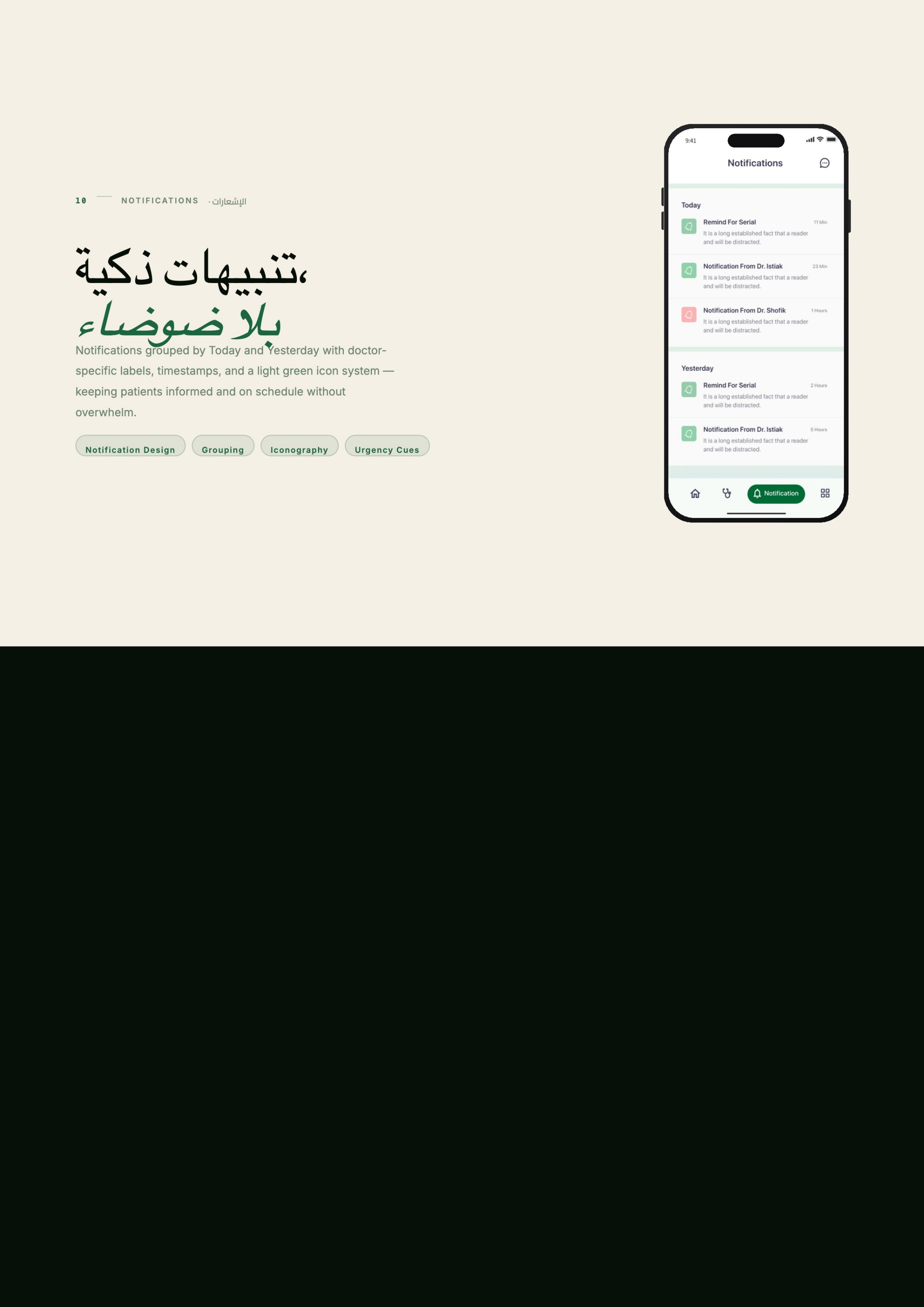
10 · Notifications · الإشعارات
Grouped by Today and Yesterday with doctor-specific labels and a light icon system — reminders that keep patients on schedule, not on edge.
Testing & iteration
Three rounds of moderated testing (8, 10 and 12 participants) plus a two-week diary study in the pilot cities. Every change below is traceable to an observed failure, not a preference.
Observed
Flat 08:00–20:00 slot grid
Change
Grouped into morning / afternoon / evening
Result
Slot selection time dropped from 22s to 9s in moderated tests.
Observed
Trust data hidden in profiles
Change
Rating, years and patient volume promoted onto cards
Result
Profile ping-pong fell from 4.1 to 1.3 opens per booking.
Observed
Telemedicine buried under a menu
Change
Voice / video / message given equal weight on the profile
Result
37% of pilot consults chose remote — mostly regional users.
Observed
Notification fatigue in the diary study
Change
Grouped by day, doctor-labelled, reminders capped at two
Result
Notification opt-out dropped below 4%.
Accessibility & bilingual craft
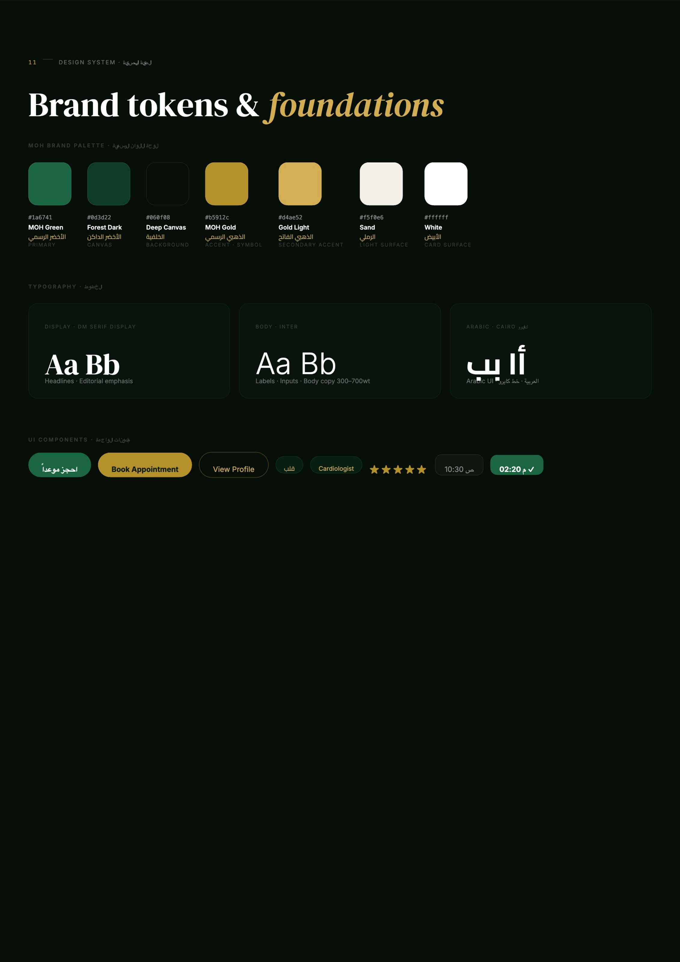
Brand tokens & foundations
Brand Green
Primary
#1a6741
Forest Dark
Canvas
#0d3d22
Deep Canvas
Background
#060f08
Gold
Accent / symbol
#b5912c
Sand
Light surface
#f5f0e6
White
Card surface
#ffffff
Display · serif
Editorial headlines and section numbers.
Body · sans 300–700
Labels, inputs and long-form copy.
Arabic UI
A dedicated Arabic face tuned for RTL screens.
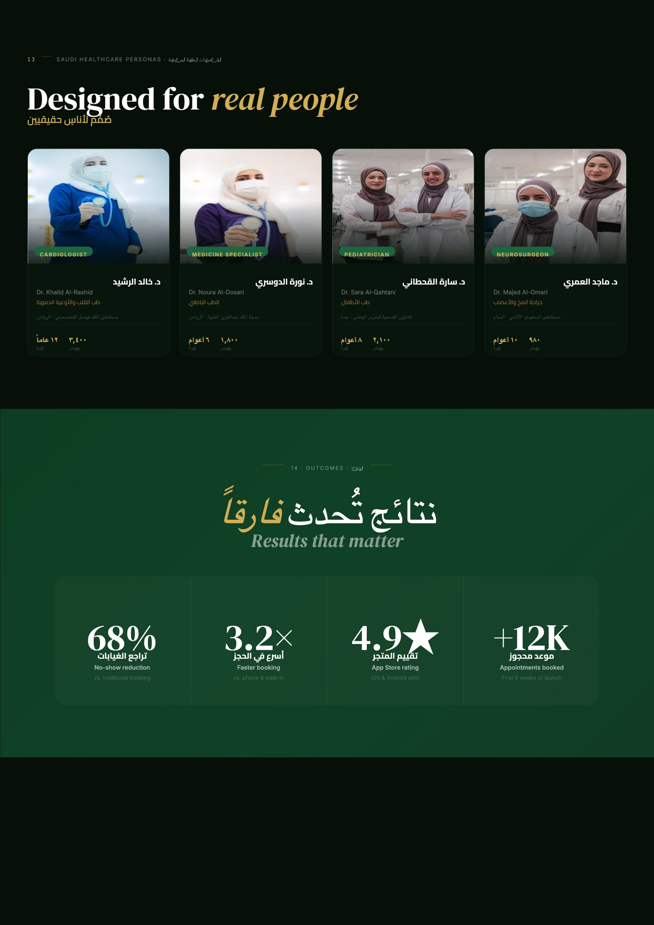
Designed for real people · صُمم لأناس حقيقيين
Cardiologist
د. خالد الرشيد
Cardiovascular medicine · tertiary hospital, capital city
3,400 patients · 12 yrs
Medicine specialist
د. نورة الدوسري
Internal medicine · medical city, capital
1,800 patients · 6 yrs
Pediatrician
د. سارة القحطاني
Paediatrics · regional health authority, coastal city
2,100 patients · 8 yrs
Neurosurgeon
د. ماجد العمري
Neurosurgery · private specialist hospital, east
980 patients · 10 yrs
My role, decisions & constraints
I owned the framing board that aligned health-authority stakeholders, the information architecture, the bilingual component system, and the clickable prototype used for pilot testing in two cities.
Decision — booking before browsing
The home screen optimises for the returning patient with a specialty in mind; discovery lives one tap deeper.
Decision — trust signals on cards
Rating, experience and patient volume were promoted from profile to card after test users bounced between profiles.
Constraint — low-bandwidth regions
Lists degrade to text-first rows and video calls fall back to voice, so rural users still complete the flow.
Constraint — public-sector accessibility
Minimum 16px body, AA contrast on green surfaces, and full RTL mirroring were non-negotiable.
Shipped
10 core flows, 40+ screens, a token library and an RTL/LTR component set handed to the engineering team.
Outcomes · النتائج
68%
No-show reduction
vs. traditional booking
3.2×
Faster booking
vs. phone & walk-in
4.9★
Store rating
iOS & Android pilot
+12K
Appointments booked
first 8 weeks